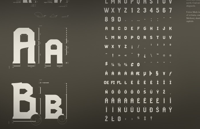
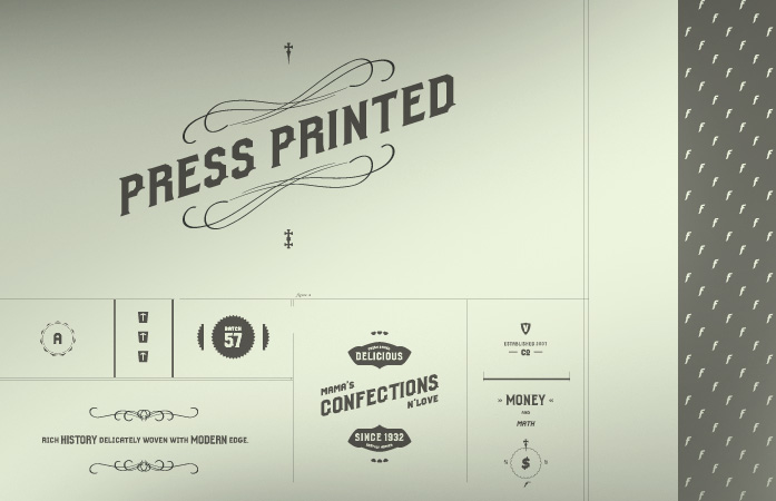
I've been really tired of seeing how much brothers gets used, so I wanted to make an alternative with a little more character.
Thus, union made:
| Attachment | Size |
|---|---|
| unionmade_03.jpg | 48.66 KB |
| unionmade_01.jpg | 57.46 KB |
| unionmade_tester.pdf | 80.37 KB |
I've been really tired of seeing how much brothers gets used, so I wanted to make an alternative with a little more character.
Thus, union made:
| Attachment | Size |
|---|---|
| unionmade_03.jpg | 48.66 KB |
| unionmade_01.jpg | 57.46 KB |
| unionmade_tester.pdf | 80.37 KB |

Would love to see a pdf (or more visuals closer up).
I think it may well be superb!
i'll post a pdf tomorrow AM :)


This looks really interesting. Let us know when you post the PDF.
-matt
Sorry this took so long... check out:
It would help to see the letters close-up, and to see some actual text set in it. I like it in general. It's hard to tell, but it might be a bit too regular & consistent across glyphs -- almost formulaic. Varying some of them a bit might be in order.
-matt
Couple months later..... added a PDF for you guys to peep.
Ned, Ned, Ned...Constructionally speaking, this is absolutely outrageous and makes no sense at all. So I have to ask the question, why do I have such a broad grin on my face every time I look at this bad boy? There are some crazy curves in it that I would never have chosen in a million years. That said, you're most definitely on the edge of something very, very cool. Maybe I want clearer rules to be established across the font, for example the R has an ink trap on its counter that the B doesn't have. Why? And yet, it's a thing of beauty and very different. Is it pure self-indulgence on your part or do you have a 'use' for it (other than bringing a smile to people's faces, of course)?
hah, nick..
It's the first font I've really ever spent much time building. So what your seeing is a series of mistakes, luck, an appreciation for history + the midwest, with a touch of bare-bones (typography 101 represent) intuition from a 23 year old kid out of college.
Yeah, i see what your saying with the ink trap. I really wanted to build this font to have a certain small town charm, extra character if you will, but still work as a system. It does have hic-ups, things that come from no where (i.e. the A).. but aesthetically speaking I feel like it mostly holds together (the X has been troublesome).
How would you suggest I proceed from here? Really want to make this thing mint.
Some minor points: The crossbar on the small-cap a seems too wide. The top of the small-cap b seems too thick, and I agree with Nick that both Bs need ink traps like the P and R. I'd like to see punctuation. You might experiment with making a few of the glyphs wider, like the N, R, X and K -- right now it's almost monospace with wide M and W.
I particularly like the flair on the top of the B, the diagonal crossbar of the A and H, the ink traps, and the punched-out detail in the lower right. In general I think this is great and nearly ready for prime-time.
-matt

I worry a little that the dingus in the lower right makes the O look too much like a Q.

Nice work, Liked this when I first saw it in Sr. Project.
Fantastic work. Minor thing, but I feel like the 3 is a little off. Where all the angles meet on the left seems ot be a bit jarring...makes it look like it's hunched over almost. Still awesome though...if you were selling this somewhere I'd buy it.
Captured from web.archive.org on 17 Apr 2015. view this capture