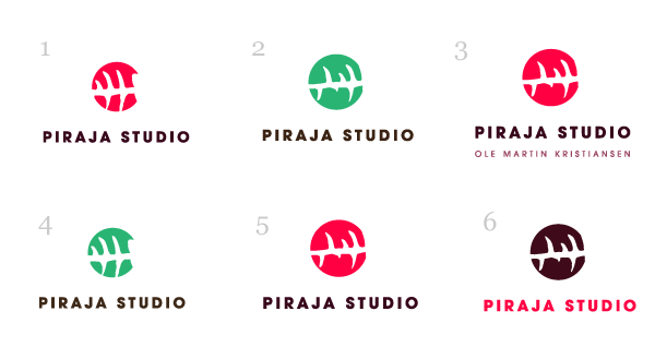
Hello lads. New to the forum, although I've been reading for a little while.
Anyway. I'm working on a logo for the little graphic & web design business I have.
The name of the business comes from Norway, as it was originally ment to only have clients locally, but as I've started with my studies I'm going to apply to jobs and hopefully have clients internationally. "Piraja" means "Piranha".
I'm satisified with the mark and the typography, but the reason I'm asking for feedback is because this whole process has taken me many months, and the mark and the typography came in my mind last night. So I want some objective feedback from someone who has never seen it.
I'm most happy with the mark and the colors in 3 and 5, they are the same expect I've added a line of text with my name in 3.
Please help me out with this, any feedback is appreciated.