
I have been pushing the extremes of Boulder to creates interpolation styles. Here is Dez Boulder superego Hairline to start off.
ChrisL
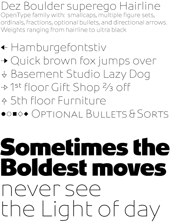
I have been pushing the extremes of Boulder to creates interpolation styles. Here is Dez Boulder superego Hairline to start off.
ChrisL

As usual, good looking font, Chris.
Is your r (and to some extent t and f) overkerned?
If your x is going to have fluid arms, then shouldn't the v, w, y and z too? I guess what I'm really saying is I think the x should be straight. I notice now that the y is slightly curvy. Hmmmm. Love to see a pdf.
N
Nick,
The y, v, w, x, and k all have some curve to them. The x perhaps a bit more than the k. Part of this is setting up for the MM extremes for interpolation. After I do some of the between weights, I may have to revisit the x a bit.
The kerning is not there quite yet.
Thanks for your help, Nick! I will post a PDF soon.
ChrisL

I feel in lightening the font, the rhythm of widths may have gone a bit off. For example, the 'a' feels to me too wide, and maybe the e. I guess there's always a question, whether you go more for preserving the shapes of the counters, or the outside.
Bill,
I took a midline when choosing the shape. The "a" may be a tad wide at larger sizes but is better smaller. The proportions are not humanist, I admit so "a" will seem wider than typical humanist faces. I always worry about the counters of a and e getting clogged and dark so feel better about making them open. This helps in interpolation but I may have to go back and adjust the hairline weight "a" afterward.
ChrisL
Captured from commoncrawl.org on 26 Apr 2015. original URL