
Hello,
I have posted previously a thread about my amateur attempts to make screen font display more crisp on LCD screens, while still preserving font shape. I would like to get some expert advice/opinion about the potential of the method described bellow to display screen fonts.
In my previous post (Help with font Rendering), Twardoch suggested the use of the "Antigrain geometry" library and Hrant reccomended Mana pixel font (which indeed looks as crisp as possible and very attractive). Thank you both.
However, my goal is to have a method applicable to any font. I was aware of the Antigrain site, but since I am a beginner I chose a much simpler approach based on the algorithm invented by Kim Oyhus: SubLCD (http://www.oyhus.no/SubLCD.html). SubLCD is claimed to allow a 2x compression on the horizontal axis essentially without loss of information.
The obvious thing to do was to generate output text/fonts (as bitmap, DIB) at 2X higher horizontal resolution than requested, then resize it to the final dimension.
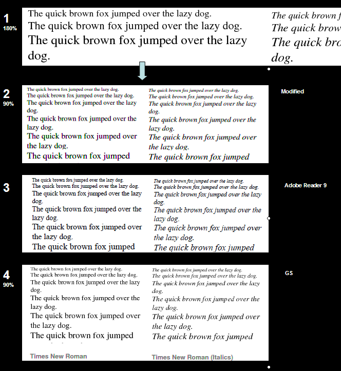
I used Ghostscript (GS) to obtain the bitmap of a pdf page (antialiased fonts) (Image 1) then resized it (result: Image 2). Compare with Image 4) - GS output without any modification; The method produces some color artifacts that on some LCDs can be annoying.
To me, it seems that font appearance is more consistently preserved in Img 2 vs Adobe (img 3) and still readable at small sizes, but the color artifacts make this method still not very successful.
Please let me know what do you think about the results shown bellow:
1. Ghostscript image: Original bitmap used to render the text: 2X size (180% zoom)
2. Ghostscript image: Final text obtained by resizing 1) to 1X (90% zoom).
3. Adobe image: The same text as in 2) rendered in Adobe Acrobat reader 94.
4. Ghostscript image: Text at 1X (90% zoom) without modifications.
Thanks in advance for any comments


