
Typeface inspired by Victor Jara.
Mainly designed to short texts on websites.
two parallel versions
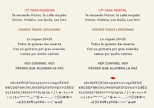
Typeface inspired by Victor Jara.
Mainly designed to short texts on websites.
two parallel versions

I love it!
I'm not sure how you were specifically inspired by Victor Jara, although both faces have a great Latino feel to them. I particularly love the all caps redonda.
I am noticing in the lower case redonda that some of the letters with long, straight lines (like d, h, j) feel darker than the short, round letters (o, m, n). I'm not sure there's much you can do about that—I think it just happens because they have a longer line of uninterrupted pixels. It doesn't bother me too much. Overall, they are both beautiful and legible.
Will it be available to buy?
Analisa
Hello Analisa, thanks for the comment.
The inspiration doesn't come directly from Victor Jara's work. It's only the name.
About the long lines they are a little bit darker, but not enough to change the structure.
And yes, will be available on september in latinotype foundry.
jko
Captured from web.archive.org on 14 Apr 2015. view this capture