
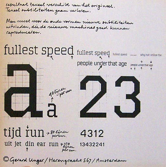
While not mind-bogglingly impressive this super old Unger design looks sophisticated enough this if it were released this very day it would not feel out of place. (a lo-fi Kontrapunkt condesed?)
He also has readability down-packed... notice the ink traps and slabs.
http://www.hetnago.nl/object.php?id=10666
But the best part?...
Notice his handwriting. Don’t you need that!? I do. Mr. Unger needs to digitize it right now.
Squatty x-height, low contrast, and semi-connections. What’s not to love!
Mikey :-)


