Typophile

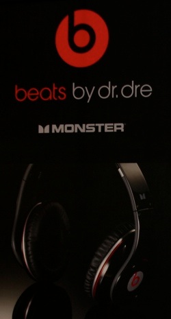
Dr. Dre Beats headphones packaging/publicity font

sampablokuper

http://forum.ecoustics.com/bbs/messages/47077/447929.jpg
http://cache.gizmodo.com/assets/resources/2008/01/dr_dre_monsterwtmk.jpg
http://beatpress.files.wordpress.com/2008/01/sdlkfwdlkfncwsldnvclksdnc.jpg

I rather like this kind of font: no serifs, no tail on either the b or the d. But I don't know much about typography, so I'd be very grateful if somebody could tell me the name of the font and/or the name of this kind of font (is there a family into which it belongs?).

Many thanks,

Sam

I think it's one of the weights of Chalet 1960.

I would classify this as a Bauhaus style typeface. You can find similar ones here.

- Lex

Ok, I've found this page with what I think are different weights/styles of Chalet. The 1970 ones are closest to what I'm after, but they have a slanted bar in the 'e'. Ideally, I'd want a straight bar.

Harry is pretty close too, but has a curved descender on the y, whereas I prefer a straight descender.

The hunt is on!

If it weren't for its dratted e, Tschicholina would fit the bill. Unlike the font in the headphones publicity, it has no stem (is this the correct term?) on the r, but that doesn't bother me.

PS. Lex, I meant to thank you in my last post, for getting the ball rolling! Thanks :)

Scratch that. Tschicholina's k, n, and t are no good either.

Hi Sam,

Yes, I meant Chalet 1970, not 1960.

Chalet was designed to be mixed and matched, so the 'e' could be from one of the other "years", although on closer inspection, your original sample looks more like a modified Avant Garde to me (the narrow 'r' gives it away).

- Lex

Hi Lex,

Your suggestion that the Dre font is modified Avant Garde makes sense to me. How I would duplicate those modifications in my own work is something I guess I'd have to research...

I've seen this logo before!

www.delahunty.ie

This one's a "b" though. Did you see that? a "b".

God you're getting very worked up there Pen. Should have probably put a smiley after my last post.

In fact I have spotted dozens of these d/b logos. Here's another one :

Sorry . . . sarcasm doesn't come across too well on the internet. Probably should've put ":-p" after my post :)

Captured from web.archive.org on 14 Apr 2012. view this capture