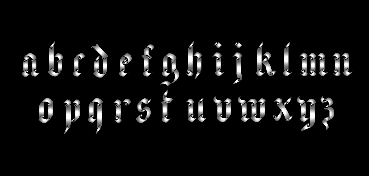
Very interesting font!
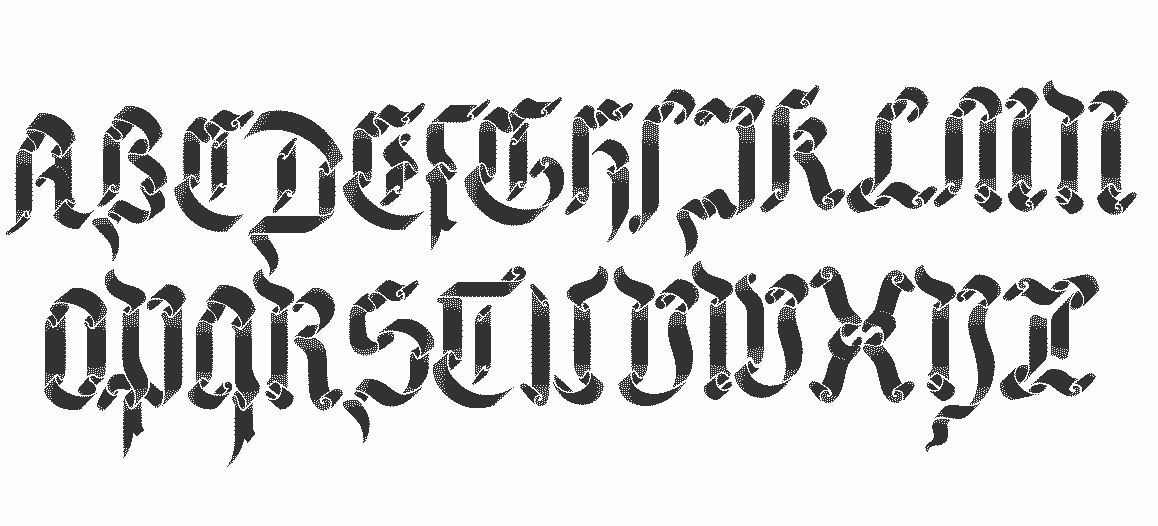
The bottom (lowercase) set has a couple issues that I can see.
-The "e" looks too similar to the "c" and by itself looks more like a small "p". Does the stem (or descender) have to be straight? If not, I'd curve it or give it a tail that came back under itself to the right to give it more shape.
-The same with the bottom of the "c". It really looks more like an "r" right now.
-The "z" looks more like a "3" to me. I know it's supposed to be a cursive/script "z", but as it is right now, you'd be spelling 3ebras, not zebras.