
Hi everyone,
here is a typeface of mine on which I am working.
salute
Stefan
| Attachment | Size |
|---|---|
| Reflection_probe.pdf | 39.63 KB |
| ChristianDior.pdf | 61.62 KB |
Hi everyone,
here is a typeface of mine on which I am working.
salute
Stefan
| Attachment | Size |
|---|---|
| Reflection_probe.pdf | 39.63 KB |
| ChristianDior.pdf | 61.62 KB |
No comments?
:-(

I really like it! It's well drawn and it has an appealing style. My only problem personally, is that it's easier for me to critique if it was set black on white. Do you think you could provide another pdf? Thanks, and nice work!
Hi Joachim!
Thanks for your nice comment!
You are perfectly right what concerns the presentation.
It was part of a grafic design pdf (that doesn’t convince myself either;-)
I will see what I can do. I do not like the monitor white. It seems so hard to me.
But I’ll do something.
Thanks again so far
Stefan
Hallo Stefan,
sehr interessant, gleich zu Anfang, ich bin kein Schriftgestalter, Ausrufezeichen.
Mein erster Eindruck ist … Origami. „Aus Papier gefaltete Schrift“, das habe ich so noch nicht gesehen. Dein Blindtext sieht für mich auf den ersten Blick sehr klassisch, sehr roman aus, gefolgt sogleich von „seltsamen perspektivischen Verschiebungen“, wie gesagt sehr interessant. Mehr als 2 Bier habe ich gerade, am Fr. abend, 22.41 Uhr, nicht intus :))
Grüße Thomas
Frutiger hat ja am Anfang Schrift ausgeschnitten, siehe Ondine …
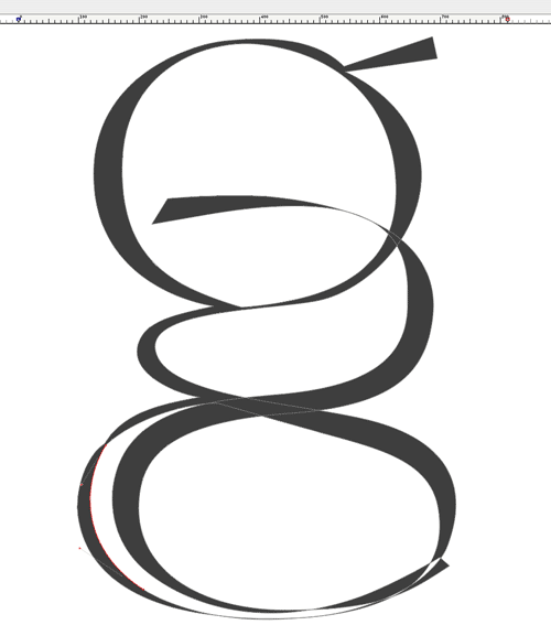
Dein g hat in der Vergrößerung einen Darstellungsfehler, nur so als Hinweis
Hallo Thomas!
Danke für Deine sehr interessante und sehr treffende Kritik (=Lob).
Origami? hm, da war ich noch nicht drauf gekommen.
Aber zum einen finde auch ich, dass sie eine klassische, „romane“ (lustig, wie Du das auf den Punkt bringst) Orientierung hat.
Tatsächlich trieft meine Bewunderung für die Jenson Antiqua (Roman) ihr aus allen Poren.
Nicht nur das typische e sondern auch die Ausbalancierung des g etc.
(das hat seit 1470 niemand mehr hinbekommen!)
Mit den perspektivischen Verschiebungen hast Du es auch ziemlich gut getroffen.
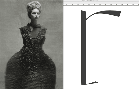
Tatsächlich war ich bei dieser Type von einer Fotoserie (ich arbeite immer nach Frauen/Modefotografien) inspiriert von Steven Meisel aus der Vogue Italia (Titel „Reflections..“)
Mit merkwürdigen Filtern glitten die sehr klassischen Aufnahmen in bestimmten Bereichen ins Ungewisse, teils Verzerrte ab. Schätze, das hat irgendwie seinen Weg in die Schrift gefunden. Tatsächlich finden sich Doppelungen von einigen Innen und Aussenformen an verschiedenen Stellen der Buchstaben wieder (an Stellen, wo sie nicht hingehören).
Wenn Du willst kann ich Dir mehr Bilder dazu schicken/bzw. reinstellen.
Das mit dem g war mir auch aufgefallen. Keine Ahnung woran das liegt.
Danke nochmal
Stefan
Hallo Stefan,
ja das war als Kompliment bzw. Assoziationkette gedacht und soll(te) anregen!
Ich hatte das letzte Posting auf deutsch geschrieben, das ich in dieser Art nicht auf Englisch hinbekommen hätte.
Interessieren würde mich besonders dein Inspirationpart „Reflexions“ (wenn du Lust hast, könntest du mir ein Foto bzw. ein Scan per PM zukommen lassen).
Ja mehr Ansichten deiner Schrift, auch s/w, wären reizvoll.
Vielleicht versteife ich mich etwas zu sehr auf Origami, aber diese Richtung gepaart mit „pure roman“ könnte doch schlussendlich zu einer eigenständigen (Display?)-Schrift führen, ein bisschen künstlich dürfte das schon sein für meine Geschmacksnerven, sich nur keinem Jenson zu sehr hingeben ;)
Viele Grüße und frohes Schaffen, wie man in Württemberg so sagt ;)
wünscht Thomas
PS Die Latinos machen solche Design-Threads auch immer gerne in Muttersprache, also diesmal teutonisch von meiner Seite aus …

The two things that most stand out two me are related, the bottom stroke of the c and the e. They just look a little like they're tumbling over on themselves, and so while the rest of the letters look almost like impossibly perfectly balanced wire statues of sorts, those two seem a little too impossible. (okay, on retrospect, that description might make no sense whatsoever ha). I think if you can extend the strokes a little bit more it'll balance those letters again. But I love the overall feel.
«El futuro es una línea tan fina que apenas nos damos cuenta de pintarla nosotros mismos». (La Luz Oscura, por Javier Guerrero)
Hi Thomas, hi Matthew!
Thanks (again) for your compliments and critics!
I am very glad that you feel interested in my very personal characters.
Good feeling! Makes courage to go on in times like these where my inspiration seems a bit low. ;-)
Thomas, what’s wrong with Jenson? He did the most inspired and perfect roman type in history of humanity!
(I am sorry for the Aldus folks, but his rhythm of letters is unbeaten up today! ;-)
Yet, I believe its personal enough and specially with this character I am almost afraid of changing anything.
Even making it better. It came so suddenly to me and everytime I tried to modifiy something it turned out to loose something of its freshness (I hope). Matthew, you are certainly right what concerns ‘e’ and ‘c’. I tried to do so and returned to the start after all.
So I have decided to make little changes. I hope you stay with it nevertheless. Thanks again for your critics and interest!
Very very nice from you both.
When I return from work I look to place some pictures of its process.
Matthew: You definitely have to translate the sentence that you cited in Spanish above.
Seems very very interesting to me! Currently I am trying to gether some thoughts for a book more about beauty and its research in general. This thing with the thin line (my Italian permits me to understand something vaguely) is definitely of great interest for me!
Thanks again
hear you
Stefan(o)
Hi Thomas,
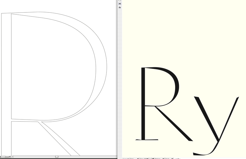
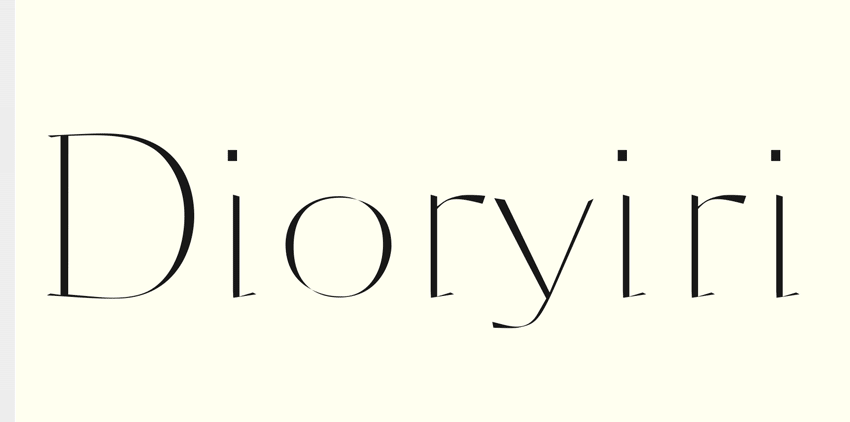
here are some pictures.
Maybe better if you drag them on your desktop.
Thanks again for being interested.
Stefan
I had problems uploading this one
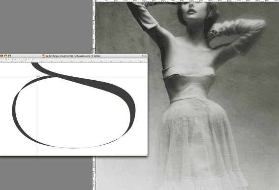

I kind of like the feeling of this, especially when it's small, but I think that you have to work more on the details to get “smoother curves” – as we say ;-)
And perhaps also experiment (or study) a little with the angle that a pen would have wrote those letters in. That is if you imagine a broad nib pen, how would you have hold it? In what angle? And what effects would it have on your letters. Then of course, you can move on away from that, but as a start it is good to think a little bit on that.
Good luck with your letters!
Hi Goran,
-> to work more on the details to get “smoother curves”
That’s exactly what I wanted (and still want) to avoid at any cost!
I would like (and I think I did) a typeface that doesn’t look digital.
Beziér curves changes natural form. And therefor I am experimenting mistreating them.
Thanks for your interest and wishings
Stefan
Hi again,
sorry I was in a hurry a bit.
Your idea with the broad nip pen is certainly good and right.
Yet I am orientating myself with other forms that I want to achieve/understand/simulate.
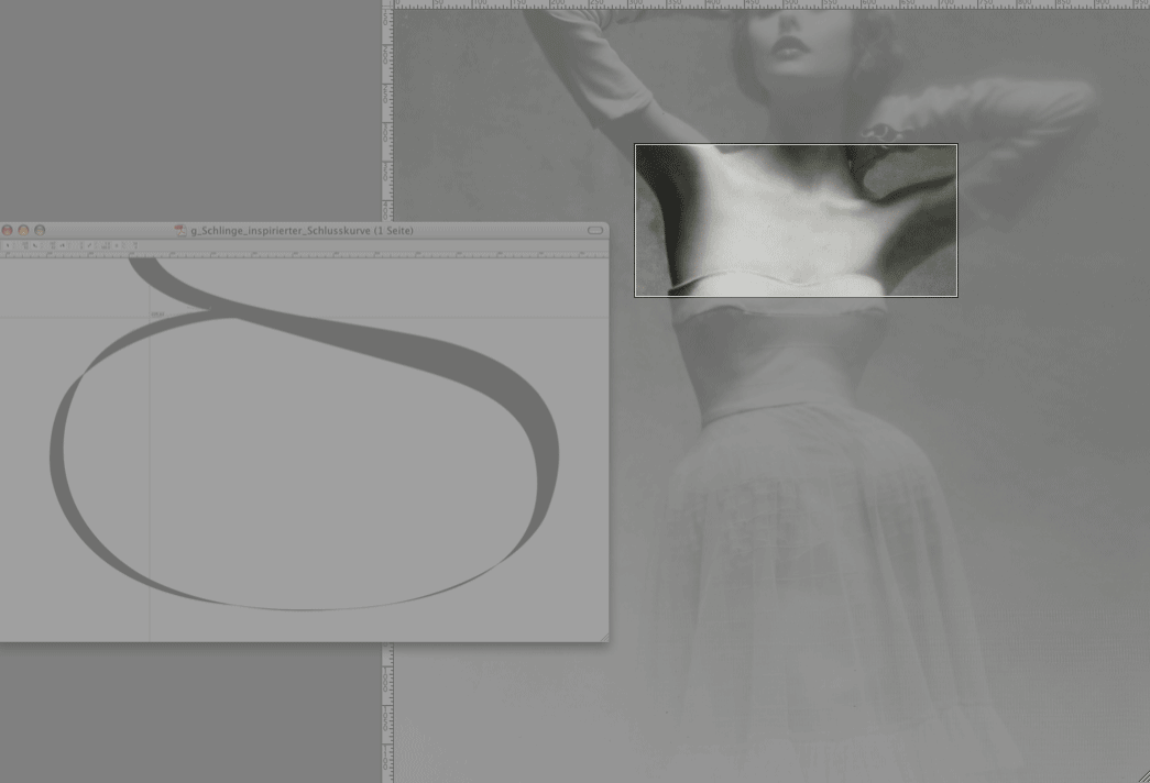
I attach another photo. Look at the part of neck, where those tiny vertical muscles (very thin and sharp) only a little bit make themselves visible under the skin. Then there are others more evident. This is what I am searching for: Beauty.
Zapf did some ver precise and good calligraphic typefaces, and others, too. I find them boring, I am sorry.
Beauty for me is different. You don’t construct it. You feel it, try to catch it, but then you let it. One wonders why a form is beautiful, inspiring - and another is not. It has to do with secrets, doesn’t it?
you say: - …as WE say.
I am sorry, but I will probably never make part of this WE.
Therefor I will never be a digital typeface designer who may sell his fonts.
It’s ok for me.
Thanks again
Stefan
-> to work more on the details to get “smoother curves”. That’s exactly what I wanted (and still want) to avoid at any cost! I would like (and I think I did) a typeface that doesn’t look digital. Beziér curves changes natural form. And therefor I am experimenting mistreating them.
The whole idea with ”smoother curves” is to make it less digital looking, so that was what I meant. Sorry for not being so clear. But I disagree that bezier curves changes natural forms, I use them to make the forms so natural as possible.
you say: - …as WE say. I am sorry, but I will probably never make part of this WE. Therefor I will never be a digital typeface designer who may sell his fonts.
It’s ok for me.
I think we misunderstand each other here, I wasnt referring to any part of a group, only me really :) And hey, never say never! Your font could very well be the most selling font in a couple of years. Who knows.
Keep up the good work!

Stefan, i think your design has some real potential for a nice display font. there are forms that i find interesting and beautiful in a strange way.
if, however, your goal is a non-digital look you are on a completely wrong track. it is exactly the bumpy curves that make your typeface immediately recognizable as a digital one. that bumpiness has a typical Bezier flavour to it. just as the razor sharp intersections, like at the tail of the g.
i don’t say this is a bad thing. but maybe it is not what you inteded.
if, however, your goal is a non-digital look you are on a completely wrong track. it is exactly the bumpy curves that make your typeface immediately recognizable as a digital one.
Hm. Interesting this thought. I never saw it this way around. Could be, too.
Maybe I am too digital (for I also never do drawings by hand, immediately design on the monitor with bezíérs). You gave me a very interesting point of view with this remark.
For what regards the bumpiness I think I didn’t explain me right. I am designing now for years and years with these curves and what I meant is the following:
Everytime I use these curves in a correct way (so that near the points there are no bumps etc. - and believe me, please, I am able to do so;-) for my eyes I cannot achieve the overall form that I wanted. The relation between the tangents in their length to each other always lead to a certain character of form (to me). If one makes them smooth without allowing them to offer points of critique in a way (from a technical point of view) they secretely make curves more elliptical - really hard to explain my feeling here: the letters become digital looking. You will agree with me that nearly all typefaces on the world by now are in a certain way very similar to each other. They will never look like lets say for example a handcut Van Krimpen face or a Jenson and so on. To me (maybe I am terribly wrong here - almost like to say: I hope so) they all have this defect of being too elliptical - in a way they look strangely stretchable, smooth but not round. Not like a beautiful handdrawn circle would. Thats why I attached those woman fotos. Look at their body forms, the way the skin moves, muscles. Those forms are different to those of digital letters.
In a word I still believe that there is something wrong in a digital bezier curve. (By the way here: have you heard about Raph Levians alternative curves?) And I try under an artistic aspect to experiment with it. Making them with bumps: BUT that the overall form of letter seems to me agreeable. If you said there is something strangely beautiful (and it is far from being the result of what I wanted) in them: it is that. I refused bettering Beziers in zones where I observed that this would change the original spontaneous form.
First sketches were made in FontStudio (version 92 I think) Although I love FontLab there it is more simple to find those originary forms. Maybe because the defects of beziers show less obviously in the first steps of work.
Maybe I will never make it to explain my feelings about it.
Did you ever designed a form and then later you recognize that you are afraid of changing it?
With this character I made this experience. Everytime I tried to make something better it became worse. But now this is becoming too personal I guess.. ;-)
But I disagree that bezier curves changes natural forms
Just believe me: THEY DO!
Stefan
i am certain you can draw any form you desire using Beziers. however, it can be necessary to insert additional points.
and maybe you should not start right on the screen but rather take some piece of paper or foil and cut out the letterforms before digitizing them – or use some other analog method.
Stefan, I know you're doing this project in FontLab, but maybe using FontForge's spiros curves might help a lot?
«El futuro es una línea tan fina que apenas nos damos cuenta de pintarla nosotros mismos». (La Luz Oscura, por Javier Guerrero)

Stefan Seifert: (By the way here: have you heard about Raph Levians alternative curves?)
Yes. Raph's Spiro curves have been available as a drawing mode in FontForge for about 9 months now. If you are running Linux, or have X11 or Cygwin on your Mac or Windows PC (respectively), check it out.
i am certain you can draw any form you desire using Beziers. however, it can be necessary to insert additional points.
Guess that’s my personal 15 years experience against FontLab manual ;-)
Thanks guys!
I’ll keep on working on it.
Stefan
…
Why the hell there is no way to find to attach pdfs?
Makes me seak
Insert Image doesn’t work and I am so tired…
You can attach PDFs by editing the original post.
«El futuro es una línea tan fina que apenas nos damos cuenta de pintarla nosotros mismos». (La Luz Oscura, por Javier Guerrero)

It should be possible.
Lets ask the webmaster to let us post PDFs a well.
Thanks Matthew,
but in this way it is always attached to the first post.
If I want to attach it to the last one?
(for example here and not at the beginning?
I attached however a new pdf.
It is on the start ;-)
Thanks guys
Stefano
You didn’t do the translation of your spanish phrase!
Let me know for heavens sake ;-)
Yes, pretty much all you can do when you post a new PDF is make an announcement message like you just did to call attention to it.
Thank You, Jason!
At least now I know to be not completely foolish ;-)
Stefan

Hope it isn't too late to jump in. These are very nice. The Dior is a really stylish display and Reflection is one I would love to use, save for two problems in the text sample. Your capital C is lovely as a stand-alone, but interrupts the flow of the text. I think it is a bit too wide. And the lc letter f seems to crowd the adjacent letters. I don't know if this is due to shape of the letter or the kerning in the sample. If you ever produce a beta, I would be happy to test it.
mgk
Hey Michel!
Actually its never to late here (typophile) to jump in! (they told me, too;-) Thanks for the compliments and critics!
Actually I am still working at it. Lately I made some small caps to do a „Miss Dior“ lettering.
I am not quite sure wether I could sell it. There is too much work undone for an allround using.
I still hope to prepare very exclusive faces (most aren’t even complete) to do letterings for example as I would love
to do for Dior. For example new perfume or something like that.
My problem seems to be contacting the houses (f.e. Dior) or the person responsabile for they use to hand over any material send to the stuff offices (they are only interested however in the curriculum-right word in English?).
I will keep on working however.
And positve feedbacks like yours are certainly a great help to me!
salute
Stefan
Captured from web.archive.org on 17 Apr 2015. view this capture