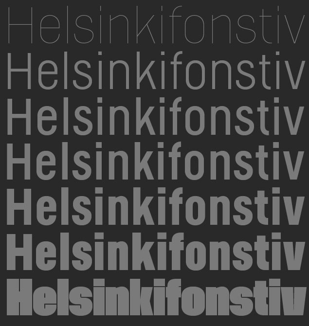
One of the first type designs I made was done during my exchange study in Finland, almost ten years ago. It was inspired by the Finnish traffic sign type and covered only one font. Now I reworked and expanded it to a family, including a extremely thin and fat one.
Have a look here. There is also a PDF available.
Hope you like it.