
Well, I showed this on that thread where we all showed stuff we were working on and said I'd be presenting it soon, so here it is!
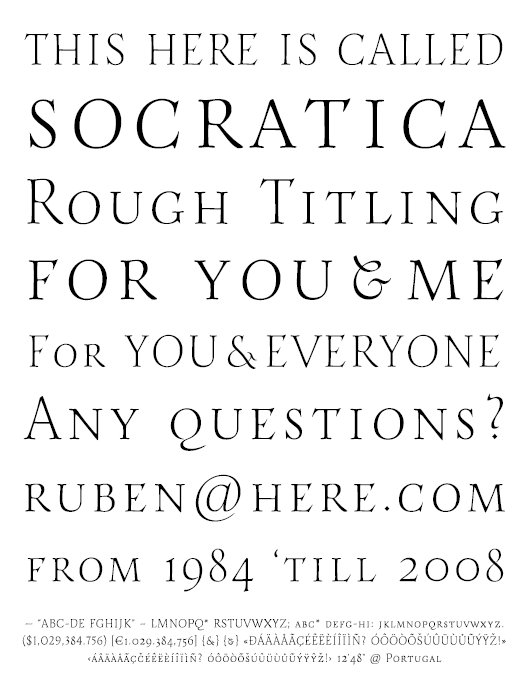
I have a hard time naming my little attempts… I'm calling this one Socratica, at least for now. Not because it seems greek at all, it's just because Socrates supposedly always announced that he knew nothing, but was quite willing to question other people thoughts and opinions (which is really profound and philosophical, but not that hard, in fact). I kind of relate to that. And I also admit I still know little about this, but here I am, trying to learn. :P (Also, Socratica sounds like a generic typeface name, which is nice and comforting.)
It's a quite fragile but rough around the edges titling typeface for display.
So, pray tell me; what do you think of it all? Is this a light to you? Could this be a regular? I'm still having trouble with stroke widths… what about that spacing? I'm thinking it's wide, but I also think that this is kind of how uppercase letters were supposed to be used, am I right? I think this keeps the colour homogenous…
Hope you have lots of stuff to say and hope you like it!
ruD
[Edit: let's see if showing a sample can get people's attention… get the pdf!]
| Attachment | Size |
|---|---|
| Socratica.pdf | 135.67 KB |
