
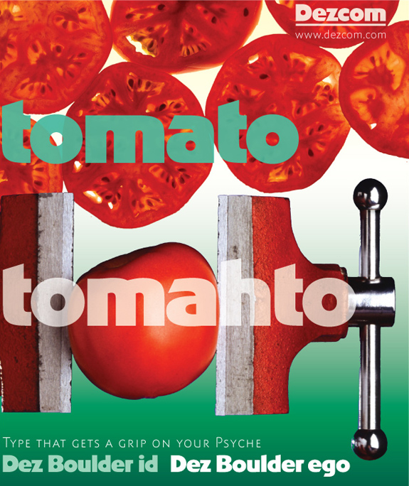
Tomato Tomahto showing of my typefaces Dez Boulder id and Dez Boulder ego.
(2 ARS photos are composited and Photoshopped)
ChrisL
Tomato Tomahto showing of my typefaces Dez Boulder id and Dez Boulder ego.
(2 ARS photos are composited and Photoshopped)
ChrisL

Why Dez Boulder is well-suited to food packaging: the counterspaces are round and organic, like tomatoes, oranges, apples, grapes, berries, that kind of thing; the letter outlines combine curves with straight lines and angular shapes analogous to the boxes, jars and tins we buy food in. The whole thing could work very well as an analogy for packaged food.
So I think Dez Boulder will be ideal for food branding & package design :^)
j a m e s
Geez, James, you are making me hungry! THANKS for the kind words!
ChrisL
But Potato is also nice :-)

ChrisL
Captured from web.archive.org on 29 Jul 2008. view this capture