Hi all,
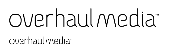
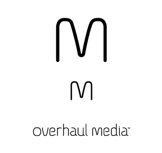
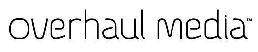
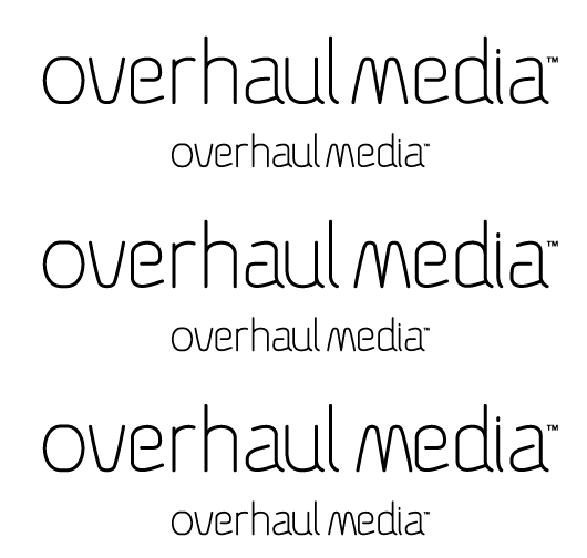
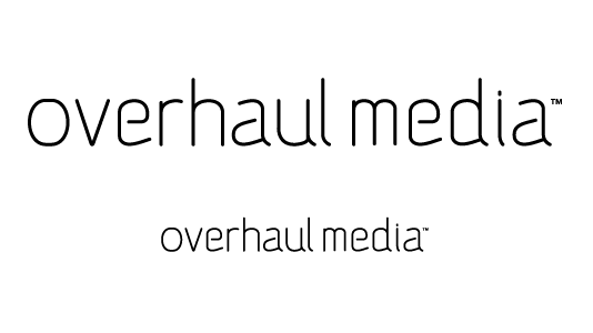
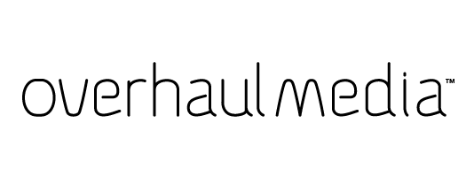
I have been working on this set of letters for the logotype for a client. The letters were created in illustrator. The type will go along with a yet to be determined mark. They are very happy with how it looks so far, but I was wondering if there were any ways that I could make it better, improve it?
I would love any feedback, comments or opinions. Thanks
Big version of the image can be seen at http://www.dache.ch/bigtype.png
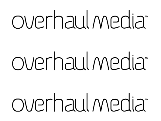
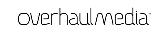
Updated version