Typophile

Examples of elegant/classy/sophisticated layout & typography?

npgraphicdesign

I am working on a project for a non-profit music organization. It's a brochure/calendar of their events for the 2008/2009 season. The last version of this project (which I also designed) was very clean, simple, structured, etc. (4panel, french fold, 11x17in.)
See example below.
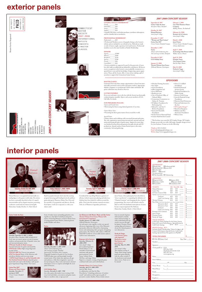
After my recent meeting w/ the client, he mentioned they'd like a different aesthetic this year. Something more sophisticated, classy & elegant. Now, that's not typically my 'design style', but it's something that's lacking in my portfolio. Most of my work is very bold and in a way, heavy. Nothing elegant about it! :P

My client asked me to forward him some electronic examples of elegant/sophisticated/classy layout & typography. I've done my research and have look at TDC, SPD, and some other type books and real-life examples. What I was wondering if you guys have any good online galleries & other links that you could post. I'm not asking you do my research for me, as I am conducting research on my own already. I just need something online that I can send to my client.

Thanks Typophiles!

In my experience, when a client asks for elegant and classy they want more white space. But it's so subjective.

Sorry I cant think of any examples right now, I'll post if I do.

Graphics...
Thanks, I appreciate it. Damn graphic design for being so subjective!!! :)

they might also be looking for a layout with a more clear focus, and fewer 'postage stamps.'
the spreads above are pretty boxy, with no 'come hither' quality... you might try pulling one iconic image, playing it a lot larger, and letting the smaller images reinforce and augment.
i would also suggest a clear headline or tag to draw the reader in... that's how i often read "elegant" from a client.

you can always try asking the client to articulate what they want in more objective terms as well. what do they find classy? and why?

at any rate, i like a lot of the work coming out of madethought:
www.madethought.com

Hi Nikita. For a classy elegant layout, keep it simple. I mean really simple, and clean. Reduce the number of elements (pics, blocks of text etc) to as few as the content will allow, and banish of all traces of clutter. Use "classy" or classical type, or if the client must have serifless things go for a sans with classical underpinnings. Keep the stylings classical. That means horizontal lines and an emphasis on horizontal division of space. Type on its side, perpendicular to the horizontal axis, will not get you or your client upstairs at the Savoy. Chuck Groth is right about the postage stamps. Get rid of them. Also use color in a restrained manner. A tiny dab, in only a few isolated places, is all you need. Make the monochrome images monochrome with just a hint of warmth rather than the overt red colorization. Dotted lines are a passé, a woeful leftover from the early 2000's.

If you want classy and elegant, be classical. One of the simplest ways of doing that is to resist the temptation to mix italics in with roman. Make it all one or the other. Be a purist.

j a m e s

Captured from web.archive.org on 26 Mar 2015. view this capture