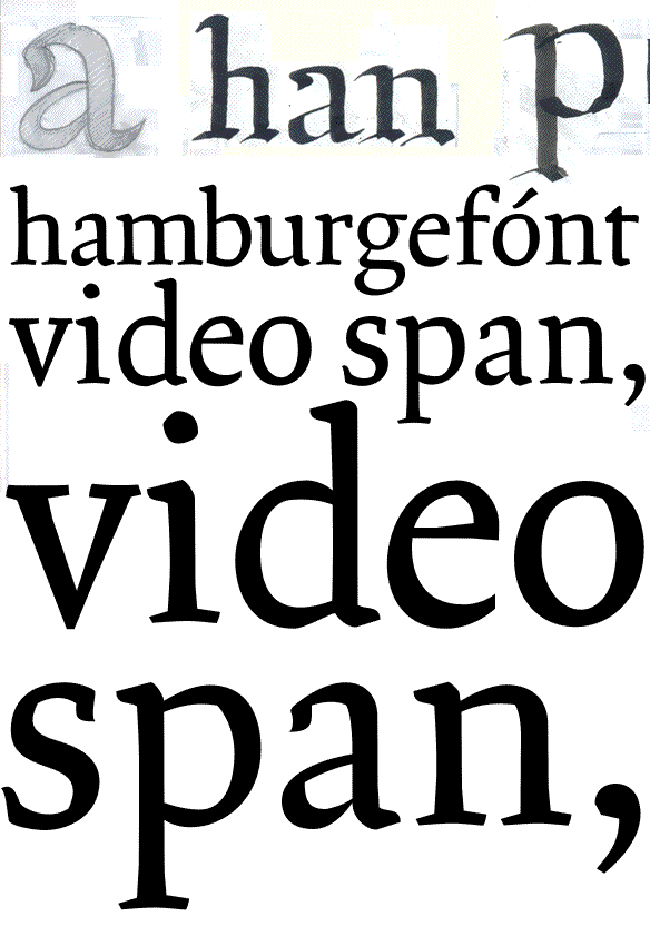
I'm the designer of a new font for long text purposes. Any comments would be most welcome.
Thanks!
—
Carlos Fabián Camargo G.
I'm the designer of a new font for long text purposes. Any comments would be most welcome.
Thanks!
—
Carlos Fabián Camargo G.

Hi Carlo
Great of you to post your design!
I'm not sure if this font is suitable for long text runs.
Especialy in the small sizes the text becomes a bit fibrant. It seems to dance in front of my eyes. That is not something you want for long patches of text.
Aside that, I'm intrigued. It has a feel around itself of something of a sketch. It has a roughness about it.
You might – however – want to take another look at positioning the letters in relation to each other. However, this might even contribute to the roughness.
Again, I'm intrigued. Especially due to the roughness.
I can not put my finger on it, maybe there are others who can?
Hope this helps.
Raymond

it's great. with such a lively design it is going to be difficult to get consistency in weight across letters but I think this can be achieved...the thin strokes vary in width a bit, and the angle of stress is not the same. See the bottom of the u and the bottom of the c to see what I mean. It's got a nice feel to it. I think the v, s, r and a need refining a bit (too heavy?) and i might be tempted to make the ascenders a bit taller.
Just some ideas... :)

Hola Carlos.
Me gusta la idea general, sigue siendo legible y teniendo personalidad incluso chiquita. Creo, eso si, que para texto es un poco exagerada, sobretodo al verlo en tamaños pequeños. Pero seguiría explorando la desproporción que generas con la e y la a, se ven muy bien como estructura.
Sobre la construcción, hay algunos contrastes muy pronunciados,en la q y la b por ejemplo, hay trazos horizontales que casi desaparecen en tamaño pequeño.
Al parecer toda la parte inferior de la g es muy gruesa. La i al contrario queda con poca presencia.
saludos. jko.
> sorry for the spanish comment, my english is really bad <

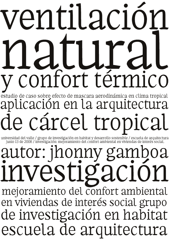
Bien por la incursión en este género tipográfico. Pienso que una letra de texto debe generar una textura uniforme al pasar la vista por encima de una página, por lo tanto creo que los aspectos a mejorar en principio son los calibres de ciertas letras que se ven muy desproporcionados y generan irregularidades en el color del texto: Es el caso de letras que destacan demasiado como las que conforman la palabra "natural" (uniformes entre sí) frente a letras como la j, la c y la e.
Por otra parte debe haber correspondencia en el contraste, los remates y las serifas. Si los remates inferiores de la l y la t coinciden por qué no asemejar a estos las terminaciones de la a , la c y la e (estas dos últimas comparten la misma forma general).
Veo también la intención de condensar un poco el ancho de la letra pero hay caracteres que no corresponden en amplitud como es el caso de la v y la f.
Hay que trabajarle bastante pero tiene detalles con mucha personalidad como la lágrima de la a y la curva en el acento agudo.
Espero no sonar muy criticón, pero esa es mi opinión a primera vista.
Hágale pues...!

Fabián!
Buen trabajo. Espero mis comentarios aporten algo, aquí van:
Encuentro:
discrepancias entre las colas de la 'e' y la 'c'
muy larga la cola de la 'l'
problemas con la modulación de la 'g' sobre todo su anillo inferior, en donde haría más pesada la parte superior que la inferior (siempre hablando del anillo inferior)
Coincido con jko que la desproporción de los signo 'a' y 'e' puede resultar interesante, pero tal como lo veo en este momento, son los signos que difieren del resto. SI sigues ese camino deberás replantear mucha cosa.
La 's' tiene algo de peso extra...
por ahora es eso... luego la seguimos, espero sean aportes!
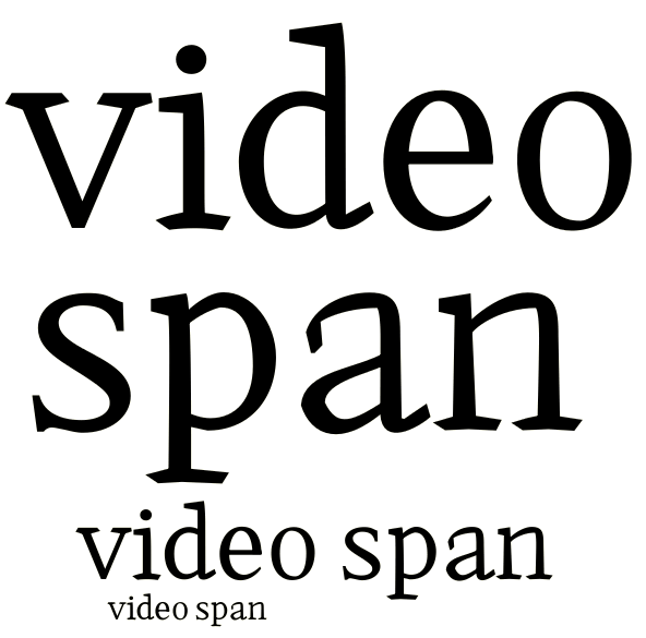
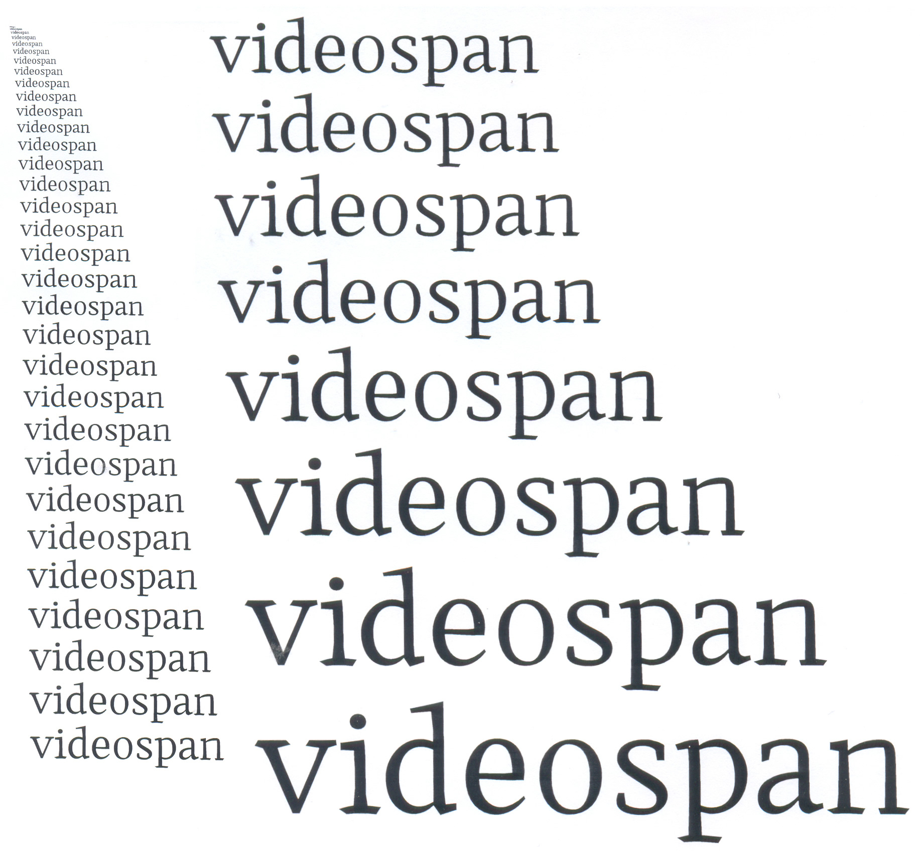
Thanks for all your time. Here are some news samples. All your news comments and corrections will be very helpful.
Thanks for your help!
*
Gracias por su tiempo! He aquí algunas nuevas muestras. Todos sus comentarios y correcciones me serán muy útiles.
Gracias por su ayuda!
—
Carlos Fabián Camargo G.
—
—
Carlos Fabián Camargo G.

I would not do any more work on the lower case without some development of capitals, figures, and small caps.

If it is intended for long text, I find the lowercase, overall, a little too loose. On the other hand I can also see this as being very playful. I might say I'd hate to lose that. I agree with Nick that the caps need to be worked on to make further adjustments and/or critique.

Hello Carlos,
I like your designs.
Especially the grey ones above (videospan) (are those drawings?).
I like the treatment and feeling you seem to have for the inclinations of serifs and penstrokes
as in the v for example.
Go on with it!
Stefan
PS
I think it will be more important wether you achieve to bring some of the stroke details also in the bezier constuction. Some lines here are loosing because of being to straight and rigid in my eyes. (v for example)
Stefan
Creo que hay un gran avance pero falta mucho por recorrer sobre todo en cuanto a generar una coherencia formal entre las letras. Veo letras con "quiebres" interesantes como la a y la n (incluso un poco en la p), pero otras parecen de diferente estilo, pues carecen de estos "quiebres", como es el caso de la e, la d y la o; en estos casos creo que debería ser un poco más arriesgado. Dee todas formas hay que buscar un equilibrio entre la experimentación y la legibilidad para no irse a extremos.
Estoy de acuerdo con avanzar un poco con las altas para visualizar mejor la interacción de las formas.
Manuel

Libro looks nice and I think it has a lot of potential. I think it would be best at this stage to determin which road to follow. At this moment there are too many (little) things going on (read: too many discrepancies) to make a next step. For Libro to work properly there has to be more coherence (as manuelcorradine also states). My suggestion for now is: take one word "handgloves" or "hamburgefontivs" and try to work that out with shapes as coherent as you can (don't forget to look at other fonts for some reference if needed).
BTW ... It *is* kinda thin for a text face. Did you test it already on a good laser printer?

I'm not sure I could see this as being a long-run face, though I think it has great potential as something more mid-length, like pamphlets or handouts, etc.
I think you might want to shift your accents a little bit to the left. They feel a bit right-heavy at the moment.
Also as already mentioned, the e and c could probably be made a bit more similar at the bottom.
«El futuro es una línea tan fina que apenas nos damos cuenta de pintarla nosotros mismos». (La Luz Oscura, por Javier Guerrero)
Matthew,
don’t you only look at ‘e’ and ‘c’! :-))))
Stefan
Well, the e and c are very common letters, and they and their variants (schwa, etc) have always given me some trouble.
But now with renewed focus on the e haha, perhaps try raising the bar a bit (literally, I mean)? You have such a low bowl on the a, having a higher one on the e might balance out a bit better.
Also, now the q and the t are getting my attention. They are the only two letters that seem to go to a pinprick point. They don't look that off to me, but I wonder if they might go even better with more blunt points.
«El futuro es una línea tan fina que apenas nos damos cuenta de pintarla nosotros mismos». (La Luz Oscura, por Javier Guerrero)
Hey Matthew!
You still didn’t translate for me the wonderful phrase that you are using at the end of your comments!
Stef

Carlos,
Your biggest problem seems to be spacing. The sidebearings on curved glyphs is too wide and on straight-sided glyphs, too tight. It will take some work to be able to see the needed adjustments but keep trying!
ChrisL
Hola CF,
A simple vista encuentro cierta desproporción en el tamaño de algunas letras: algunas son muy grandes (p. b, d, u, o) y otras muy pequeñas (a).
Comparando la a y la s junto a la p y la n en "span" parecen intercalarse dos tamaños de letra. Esto se debe, pienso, a que la a y la s son muy angostas y poseen demasiado negro mientras que las otras tienen demasiado blanco.
De todas formas, lo felicito por los avances, por ahí es la cosa...
Saludos,
Manuel

I like the progress the typeface has made, visible in your last posting. I have troubles with the ›g‹: it looks too perfect and as if belonging to another typeface. You need to get more consistency into the shapes of the serifs. Sometimes they are quite heavy and sturdy, sometimes they are delicate -- look at the foot serifs. The top serif of ›a‹ needs to be tamed, i think it’s better in the ›s‹. Do something with the bottom left inner curve of the ›o‹. But not the same corner from the upper right, rather something that cites it.
Then you need to go into spacing: start with nnnnnnoooooonnnooonnnoonnoonn, then nnnooonnononononon until the rhythm is well balanced. Then go on from nononononnonon by replacing the ›n‹s and ›o‹s by the other letters, one after the other.

some nice stuff here... i agree with j weltin, that the g looks like it has been copied and pasted from another typeface...
the lower case t needs work, the foot especially
overall, i like the 'feel' of the typeface, rough, robust and interesting
brett
Captured from commoncrawl.org on 19 Apr 2015. original URL