Typophile

New type

Kliment

Hello everyone!
What do you think of this type treatment, i'm thinking to make a font out of it.
Not sure if this is the right place to post this, hope it is! ;)
I don't have much experience yet, and i'll post whatever i do here for advices and critiques!

Thanks in advance!
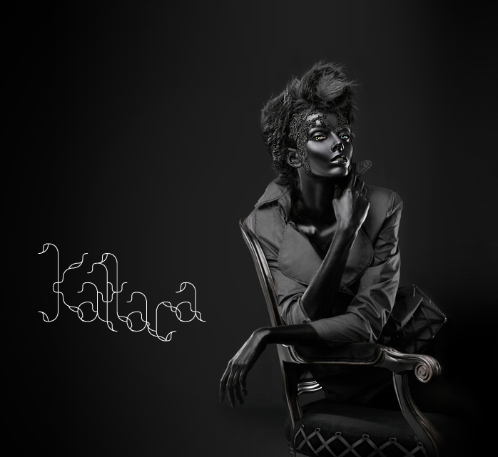
Hi Kilment, I like the typeface very unique! it has a similar feel to Cloud a contemporary typeface that I think you might like, I think yours would be pushing it to a new stage! I'm no expert but the only problem I can see is how each individual letter would interact with the next!

Oh yeah where does the photo come from? It's deadly!

Hey robbiefa,
the photo is taken by a friends of mine - Paco Peregrín (www.pacoperegrin.com ) and Kattaca (www.kattaca.com)

I have little retouch on it.

Good friends to have! makes life interesting when your designing stuff!

i like it a lot as well and yeah with what robbiefa said, i love the way the aca go together, but the a to the t looks a bit odd.

I would assume you would have to create a style that would use a strict baseline as well as a "swash" style that violates the baseline. Do you think that having the characters too horizontally symetical like the capital K would cause it to loose it's flare?

daniel

Captured from web.archive.org on 24 Jul 2014. view this capture