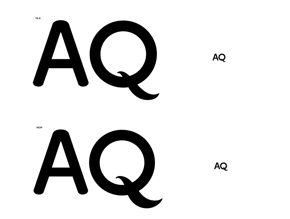
Hi there,
I'm working on a minor update to my design co.'s logotype.
Originally my goal was to improve its look and legibility at small sizes, but upon recommendation from a very talented type designer friend, I revisited the form of the tail on the Q "to play up its weird, organic shape, to balance it better with the "O" part, and by extension balance the Q better with the A." as he put it.
What I did to the Q tail:
* Heavier at bottom
* Curvier curves
* Tail extends deeper into the center of the O
* A little longer
* Added a bit of flatness to the pointy ends
The total effect seems to feel more calligraphic, definitely clearer
at smaller sizes. I worry I lost a tiny dash of the personality of the
original "slug", but maybe that can be reasserted, or maybe it's not
such a big deal.
If I stick with this direction, it seems like the A needs a bit of
"dressing up" to match. Especially after adding that vertical flatness
to the sides of the Q's tail's tips, the current contrast with the Q
makes the A feel even more like a plain-jane rounded sans.
So, how am I doing? Any suggestions on the "A"? Leave it alone? The original was better?
| Attachment | Size |
|---|---|
| aqlogo-2008-refresh.png | 10.63 KB |