Typophile

wine label & calligraphy

epixs

sorry but i don't like it much! For me it isn't well done.

Joel Santos // youremin
sound & visual

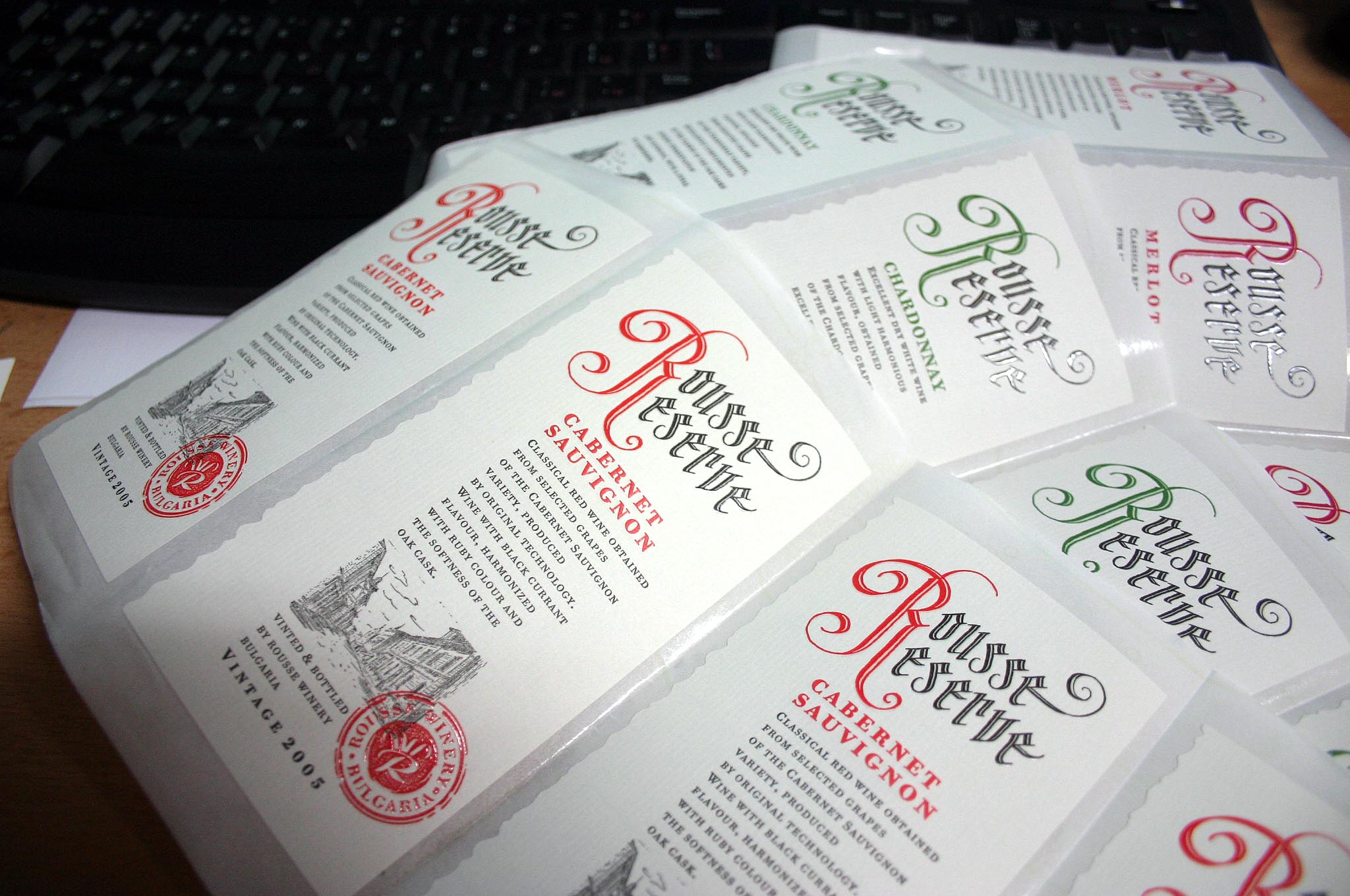
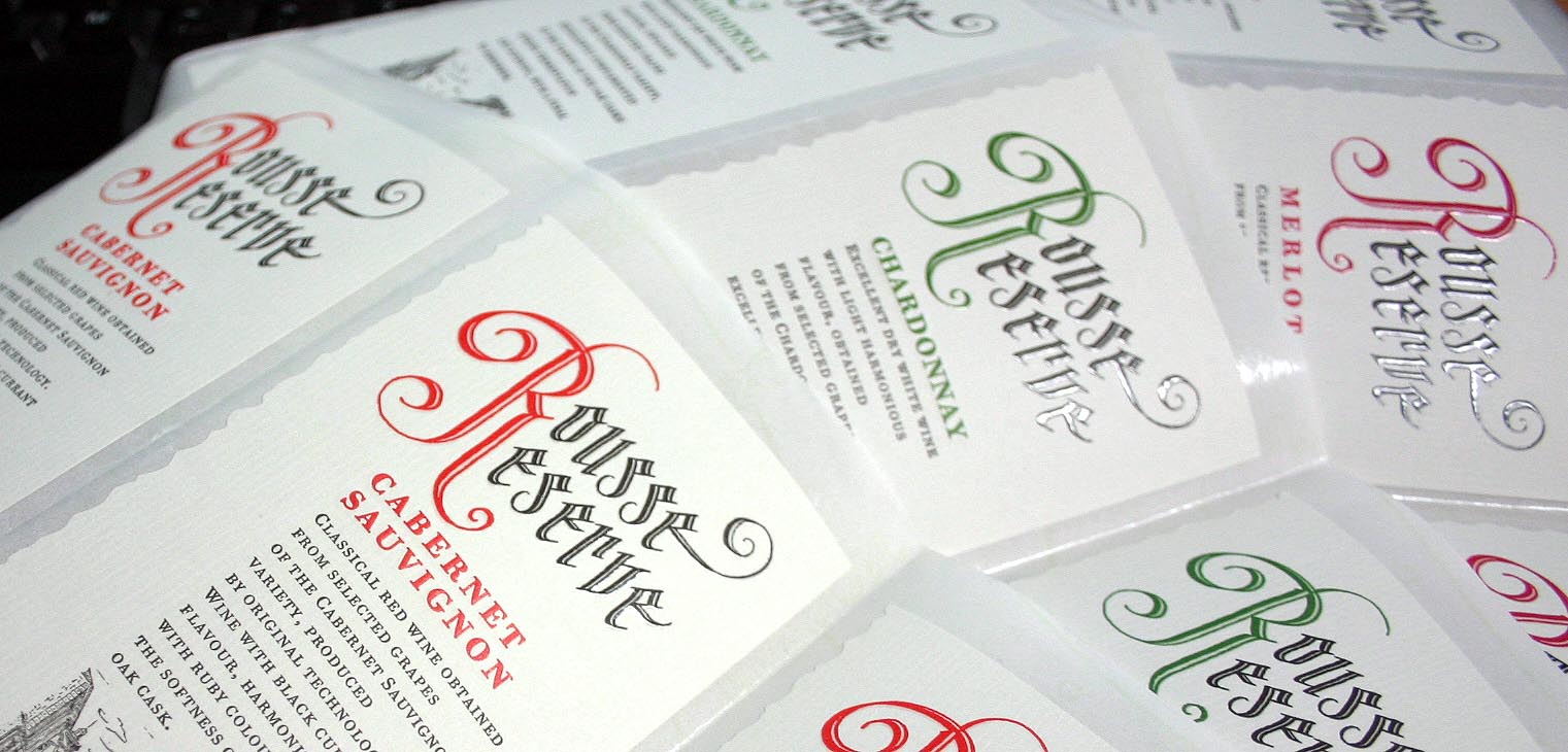
I think it looks elegant. The Rousse Reserve logo looks wonderful, and I love the use of the red stamp.

Nice Jordan. Classic!

Michael

Very nice classic label. But not distinct. But if I was a wine producer I would like it a lot. Wine labels should be classic to come extent not to confuse consumers.
___________
Robert Koritnik

Interesting e's!

> youremin: sorry but i don’t like it much! For me it isn’t well done.

Come with constructive criticism. Otherwise he's better left without comments...

You're right Zuz3l but i don't know much to say is just what i feel. I don't think there is a good connection of the logo with the rest. or maybe is the alignment.

Joel Santos // youremin
sound & visual

Thank you Kenneth.

Michael

I think it looks excellent. :)

What does "produced by original technology" mean?

I have worked in the creative department for a grocery-store chain for nearly two years. During this time, I have viewed hundreds of different wine labels.

I think this label is elegant and distinctive.

It's beautiful!! I especially love the initial R. Well done.

eliason - I am not quite sure, but as far as i know those wines have really special technology that is kept the same for decades....

10x everyone - no mater you like it or not:-))))
______________________________________________________________________________________
www.behance.net/epixs

The text rag is a little extreme for me. Otherwise nice!

I think the text rag gives the label an interesting personality. I love the craftsmanship on everything. It seems to me like a high class scotch label more than a wine label for some reason. Probably because it is not attached to a bottle of wine.

I like it too ! Specially the Rousse Reserve lettering. Lovely red. Gives a impression as if it was printed letterpress.

I'll post product photographs as soon as possible.
The label looks quite different on bittle...

______________________________________________________________________________________
www.behance.net/epixs

It looks really nice. Like AGL says, it almost looks letterpressed.

I'm sure I'll be embarrassed, but what is the serif typeface? *flinching*

I am not the target audience, but I think it is a distinct label.

well I dont't remember exactly the name - some sort of Barroque Antiqua, digitally processed to look like LETTERPRESSED:-))) Sth. like Bodoni style.... don't remember for certain...

www.behance.net/epixs
epixs@yahoo.com
+359887323000

It has some nice features. Like the hand-lettering touch and the beautiful letterpress printing.

Personally, I don't like the use of all caps for the body (bottle) copy. Plus the over tracked letters and line spacing cause readability issues. My eyes started getting buggy.

______________________________________________________________________________________
www.behance.net/epixs
epixs@yahoo.com
+359887323000

Once again Jordan... very nice.

MichaelMichael

Captured from web.archive.org on 9 Aug 2014. view this capture