Typophile

Unwanted Overlap Removal

David Berlow

Does anyone know:

The enclosed shows a letter that's been treated to an 'action set' containing only negative bolding and scaling.
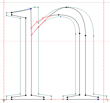

I could finish this whole l.c. in 3 hours if it only did what I asked.

Is there a way, or a version of ClownLab that DOES NOT remove overlap automatically, spoiling the action set's intent.

This letter, e.g. should remain a single contour, but it's thrrrrrreeeeeeee instead. Since recombobulating contours is ClownLab's absolute nadir function, I though I'd ask before starting an all day clown fix.

Cheers!

you must going the wrong way dude....clockwise and nonclocked over your head then.

Eh... this is actually an unwanted overlap creation. Never saw that one before, just FL's action sets creating single contours out of overlapping parts. Bolding and scaling tricks worked fine in RoboFog or Fontographer, but in FL it's a big pain.

I should've been more clear. The blue image in my illustration is on the mask layer, was the source, and is a single contour in the correct direction.

I do not mind the creation of overlaps as a result of my parameters, in fact, that's what I'm here for. If one can only parameterize to the point where 'nothing goes wrong' what's the point? Bolding and scaling tricks work fine in RF or Fog because they do not remove overlaps, that being a distinct function that anyone can, run after.

Cheers!

Well, I think it´s pretty obvious that you have run the negative bolding too far, making the contour turn inside-out, since that part of the glyph was quite narrow from the start.

Hey DB. Isn't this why Superpolator was made? So we stop tearing our hair out at FailLab?

—K

Use Tim Ahrens' Font Remix Tools

Don't SP and RMX Tools work only if there are 2 weights to work with? What David is doing here is creating a new weight out of a single weight via bolding and scaling.

Yes, FontLab, please get rid of the automatic remove overlap when bolding!

And I revive my older request that you adopt FOG's bolding method which gives much better results, both for negative bolding and positive bolding (two crappy images, each showing FOG left & FLS5 right). Also, FOG was more reluctant to insert additional point.

Karsten

Use Tim Ahrens’ Font Remix Tools

Although I generally don't object to this recommendation, the RMX Tools won't do auto-(negative)bolding on a single master basis.

However, I know that Jérémie Hornus has developed an FL macro that does exactly what you ask for: autobolding just like FL (i.e. contour offset) but without remove overlap.

I will contact him and let you know whether he is prepared to share it.

I just remembered a workaround I once did:

First, do the autobold effect to a lesser extent that you want. For example, give the parameters for weight in(de-)crease half the value.

Hopefully, this retains the node structure because no overlaps occur.

Then, use MM-extrapolation to double the effect. You would generate an instance at -1000 or at 2000, depending on your setup. This should lead to exactly the same result you initially wanted, but without removed overlaps.

If halving the values is not sufficient (because it still creates and removes overlaps), try a third, or a quarter, amplifying the effect accordingly in the end. The more extreme your amplification the more rounding errors might come into play, however.
Note that when extrapolating you should always try to work with full numbers (i.e. thousands) because then at least this step is lossless.

"Hey DB. Isn’t this why Superpolator was made? "
No, but thanks.
"What David is doing here is creating a new weight"
Was ;)

It's pretty basic stuff really.
If the action does not include change to the volume,
Then the input volume should match the output volume.
3rd c. b.c.e. I think.

Cheers!

So, you are working on three-dimensional fonts then?
Or, even fonts that make sounds? Impressive. ;)

Sorry, I didn't understand what you mean.

I think what Tim means is: instead of using FontLab Studio 5's poor "remove weight" feature (in FontLab Studio 6 there will be a better algorithm that we've taken from Fontographer), you should ADD weight using FontLab's Bold feature, and then make an MM font out of your regular and bold (with a weight axis), and then generate an instance that would be an extrapolation "to the left", e.g. with -100 or -300 or whatever. Then the unwanted problems will not occur.

A.

Adam, that is not what I was proposing but it is quite similar.

While I suggested to remove the weight to a lesser degree (say, –5 instead of –10) in order to avoid overlaps and then amplify the effect, you would do the effect in the opposite direction and then reverse it. Both using MM-extrapolation.

Hard to say which method gives better results since increasing the weight can easily produce overlaps as well. I guess it depends on design and the individual letter: the risk of overlaps through producing overly thin "negative weight" strokes vs. ending up with overly tight overlapping counters.

Anyway, this whole mess could easily avoided if the internal overlap removal was simply switched off. People can apply it in a subsequent step if they want to so I wouldn't even keep it as an option.

I'm in agreement with David here. I've long wanted an auto-bold that doesn't mess with the number of contour points. Even if the results are a little wonky, it would get you a long way.

Python anyone?

Python anyone?

Since Adam promised ...

(in FontLab Studio 6 there will be a better algorithm that we’ve taken from Fontographer)

... I think scripting anything would be waste of time (and the result would be slower than a native FLS function). Cannot await to see the update!!

Karsten

Since Adam promised ...

(in FontLab Studio 6 there will be a better algorithm that we’ve taken from Fontographer)

Adam, can you put a timeframe around that promise? Any announcements to be expected at TypeCon?

Christian A. Harder

Adam, will FL6 be coming before Bush is ejected from office or will we have to endure yet another year of FL5 and all its craziness? At least take a bug-squasher to it.
There are many illogical things FL5 does in the name of helping automatically that do more harm than good. David's example is right in line with that. If the overlap where not removed by FL, David could just slide the two points to the proper place and be done. Instead, the fixing-the-mess time is now made much harder.

ChrisL

It's not just removing overlaps that's the problem. It also inserts extra points which breaks interpolation.

yes, FL weight modification tools are far less useful than they could be. I generally avoid to use them at all because of the reasons mentioned.
The macro I have been working on does make things better by retaining the original contour structure, so that interpolation is possible. It only works with TrueType curves since it was easier for me to write the code and fonts we produce are often OpenType TTF; but it should not be very difficult to make it work on PS contours as well.

I think we can wait quite a long time before the release of FL 6... so it was not a waste of time to make such a script.
Still, it is a work in progress and only used internally.

BTW, I was kind of looking for a for a proper programmer to assist me with that project. If anyone knows a Computer Science student keen on math and geometry, let him know that he may contact me.

cheers,
Jeremie

Fontlab Studio666, oooowhooooeeeeeeoooooo. Unless you are the star, pretty lady with the tight shirt, don't go down those basement stairs, I've seen this movie before. . . you will get your overlap removed, and then, you will be One Of Them...

Cheers!

FontLab Studio 6 is seriously in the works but since Fontlab Ltd. is heavily involved with organizing the ATypI 08 St Petersburg, not much will happen by then. But we plan to do more work on it in the Fall, with a beta version possibly available in the Winter. One thing that we depend on, however, is a new version of Adobe FDK for OpenType which will include support for all of GPOS, which would allow things like mark attachment right in FLS. The new AFDKO is being developed now, as I've heard, but we cannot predict when it will be available.

Best,
Adam

"...with a beta version possibly available in the Winter."

And the Mac beta version in nuclear Winter or when Jonathan Winters is resurrected?

ChrisL

"Now is the winter of our discontent made glorious summer by this son of York"

"...but since Fontlab Ltd. is heavily involved with organizing the ATypI 08 St Petersburg..."

Wonder no more what "Ltd." stands for. And what unpretty symmetry — I'm too busy, (using bug ware), to go. If I metered it, I'm guessing dozens more could afford to, or more easily afford to go, if the bug ware wasn't... so... neglected... year after year.

Cheers!

Captured from web.archive.org on 14 Oct 2013. view this capture