Hi,
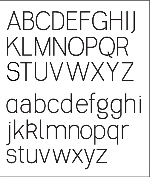
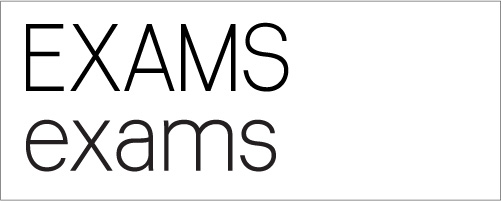
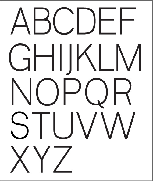
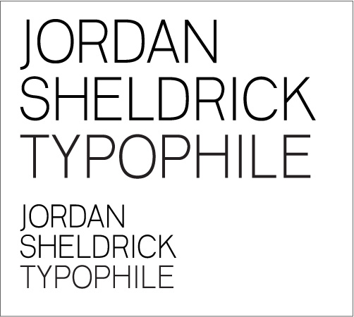
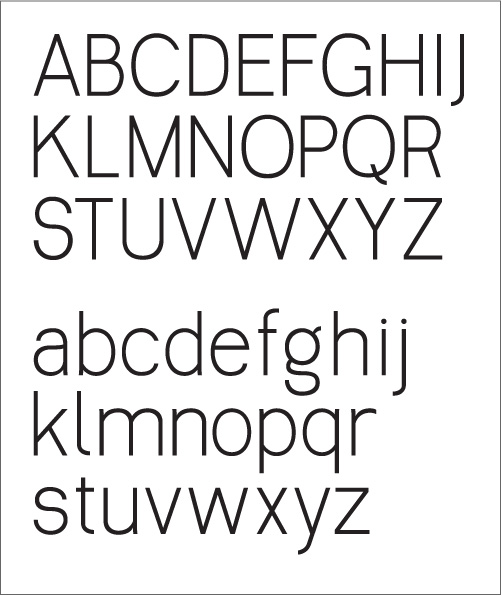
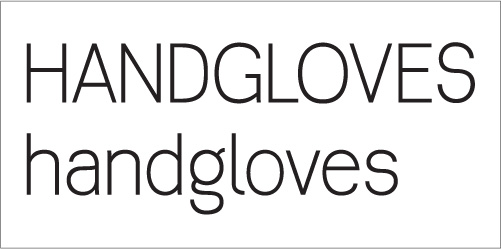
For the past few nights Ive been converting some of my sketches into letters I'm starting to like the look of. Its pretty much my first sensible attempt at something usable, so am not up to speed on contrasting and detailing so would love to open the floor up to critique.
Any feedback and thoughts are appreciated and hopefully with some guidance I could develop this into something quite pretty.
Thanks, I really appreciate the help from this level of expertise
Jordan
| Attachment | Size |
|---|---|
| web_trim_1.pdf | 222.55 KB |