
I'm trying to work out the L and E in my "Luv Ace" ambigram. And/or any other problems you might see.
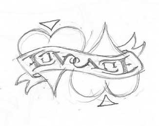
I'm trying to work out the L and E in my "Luv Ace" ambigram. And/or any other problems you might see.

The L looks allright, the u is hard to read (too thin) the E looks to be the only lowercase and is also too light, same with your c. Cool concept though.

Forgive my hack. I thought it might be easier to show you what I mean.

Basically you need to ariculate the stroke endings a bit more. I tweaked the u/c a bit too.
Hack away. I love the u/c, thank you. The problem I have with the L/E is the eye see the L as a backward E too easily. That is the sticky tricky part.

I think it is the middle spur of the L/E pair. If it had more of a curve maybe? On the L down and on the E up?
Thanks, I'll give it a go.
Captured from web.archive.org on 23 Oct 2013. view this capture