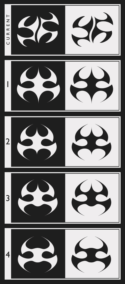
Allow me to preface this post by mentioning that the logo I currently use was concepted about five years ago when I just began working with online media. At the time, I had just started using my ’Xenethyl’ alias and wanted to design a logo for myself. Looking around at other icons, I found myself very drawn to Eidos’ Hitman logo (as many of you gamers will likely realize).
Since the original drafting of my logo I have progressed to the point where I now do freelance graphic and web work as a hobby under Xen Graphics Studios. The name comes partly from my online alias and partly from a play on the word ’zen.’
My backstory aside, I’m wondering if I may have taken too many visual cues from the Hitman logo in my personal design. If it’s not readily apparent, my logo is supposed to represent a stylized ’X,’ which, sliced in half, plays somewhat on the idea of zen and balance.
Over the years I have really become attached to the original design, though in recent months I have felt the need to update it and make the curves and weighting a bit more balanced and professional-looking. At the same time, as I have become more involved in the graphic world I have gained an immensely high level of respect for designers and artists. That being said, the last thing I want to do is blatantly rip off Eidos’ hard work.
What do you all think? Was I too inspired by the Hitman logo in searching for my own branding? Links to the Hitman logo, my current logo and revision mock-ups, and my proposed final revision can be found below. Just to be clear, the updated logo I am looking to implement is the third link.
Eidos’ Hitman Logo
Original Logo Design & Redesign Mock-Ups
Revised, Final Redesign
Thanks!