
This is a new logo design I developed (without formal design experience).
I hope this is the right forum to post this.
This logo is for a new website for professional freelance English teachers who want to work in companies teaching business English (in Europe). I want the logo to have a professional feeling but to also have a Teachers touch. "Teachers touch" means some hand written style font. I want the logo to be both the symbol and the website name (one variation outside of this is also presented). I am having a lot of difficulty with choosing a font because the name of the site is so long, ProfessionalEnglishTeachers.com . The logo colors represent the colors from the flags of several English speaking countries (sorry Ireland). The logo symbol has 3 elements: the letters "PEt", a teacher in front of a desk/podium with arms stretched upward, and a hint of the euro symbol. I would like to get feedback on fonts to use and perhaps positioning, borders, 3D effects, ect.
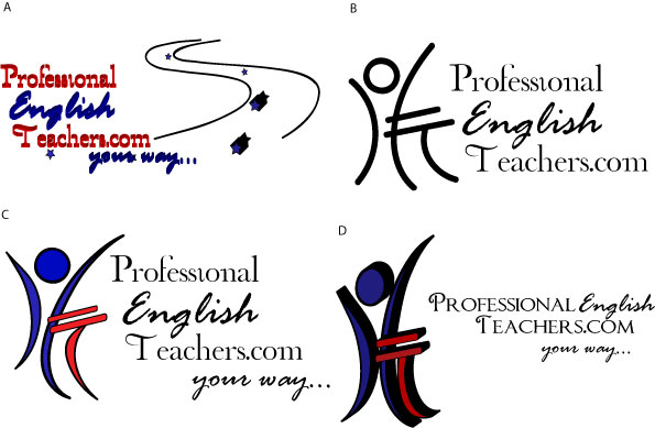
Any critic on the symbol would be appreciated, love it, hate it, rate it.
Please rate it 1 to 10 with:
10 being memorable, clever, intersting, an absolute keeper,
5 being just ok, nothing special, keep trying.
1 being hire a designer because you suck ;)


