
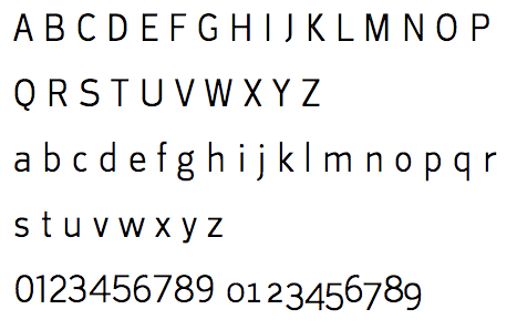
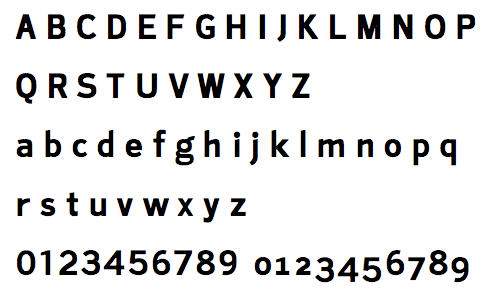
Since graduation I’ve been refining and expanding Lavinia Sans. It now comes in light and bold weights, has (deformed) old-style figures, and a host of diacritics. A little running copy appears in the PDF, but not too much as I need to do lots of spacing and kerning work. Crits on the figures would be especially appreciated as I’m pretty well convinced that they look like my dog barfed them up.
| Attachment | Size |
|---|---|
| lavinia_sans.pdf | 43.94 KB |


