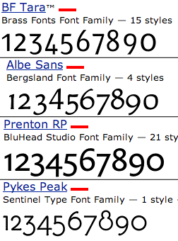
OK, So I am a huge fan of Hanging Figures (or lowercase figures, or old style, whatever). I know that some sans faces have them, but many don't.
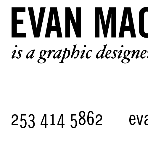
I have altered the numerals for the Trade Gothic Condensed to make the numerals look better with the all lowercase text. Still, I know better than to alter a typeface.
I would like to know if this is just dead wrong, is it okay? I didn't squish any letterforms.. I actually manipulated some of the anchor points. Part of me is ticked with myself for thinking about it, and another part likes the way it looks.
Please tell me what you think?
Thanks,
evan