
Hi,
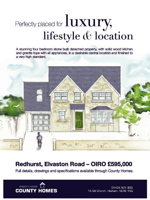
I was wondering if I could get anyones opinions on the typography, and layout of this ad, or what could be improved...
many thanks

Hi,
I was wondering if I could get anyones opinions on the typography, and layout of this ad, or what could be improved...
many thanks

It's OK. What context will the ad be shown in?
As it is now, it feels rather static and rigid. Nothing is really pulling me in.
mostly as a newspaper ad, maybe a window display poster as well

If it was up to me, I would've colored the roofs bright red. Other than that, think scale: 'luxury' - much larger, that comma is a disaster (closer and smaller). There are kerning issues in the title. 'Lifestyle & location': either bring it closer to the top line or give it an oversized pretty ampersand, maybe a color accent on the ampersand. I think it was Philip Stark who said that helvetica/(arial) when used as small paragraph text looks like shit. Try Arno maybe.
to me, to best say 'luxury' in a newspaper is to be subtle. Say less, add more whitespace.
Do you need both elevations? The back doesn't seem remarkably different than the front.
At the very least, maybe give the front more emphasis in scale and the back less.
Maybe consider a script face?
Also, where's the URL? ;o)
I was confused by the front and rear elevations. I didn't know the rear was rear until Aluminum mentioned it. Maybe the rear is anamorphically stretched? It looks taller and narrower than the front.
I agree about the whitespace, too. More would be good.

Here are my rough thoughts.
The headline needs more spacing help, but I think dropping the rear elevation, enlarging the front, adding white space, and aligning the layout a bit more on a grid (at least horizontally) are possible improvements you might consider.
Thanks guys, I'm here to learn...
I might have a rethink.
It seems it just going to be used on a display board at the development site, and maybe an A0 poster.
Their branding is in eurostile, does it matter if eurostile isn't used anywhere else, or it ends up with three typefaces being used? at the moment i've got helvetica and didot, and their branding in eurostile

I would place the "Perfectly placed for"-text a little higher, so it's vertically aligned with the "luxury"...
How about making the "luxury" to a script type, and maybe another warm color?? Just thinking loud...

Just a short thought: I would consider a more luxurious looking &, perhaps along the lines of Burgues Script

Is that the only image they supplied you with? That doesn't scream luxury to me at all. The blues make this very cold; it's almost mono-chromatic...when I think of a luxury home I think of warmth; something inviting. It's also very flat...it seems there could be more depth. I also agree with ZUZ3L and tina's suggestion of a script font or possibly something clean and modern.
Could you possibly work in smaller photographs of the inside of one of these luxury homes?
Captured from web.archive.org on 24 Aug 2013. view this capture