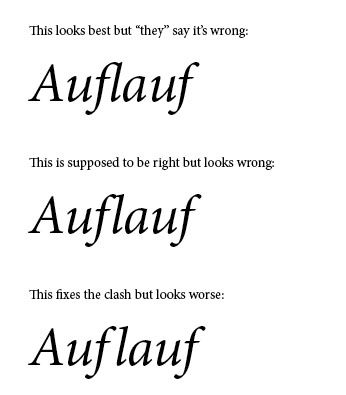
I know that for some languages, there are specific rules as to when a ligature should be used. In German for instance it is said that ligatures should not be used for compounds or where a word's stem and its prefix are connected. A common example would be the word "Auflauf": no fl-ligature because it is a compound from "auf" and "lauf".
Nevertheless, there are quite a few typefaces that would just look stupid if one wouldn't use the ligatures as the spacing is set up in a way that assumes that whenever a ligature could be used it will be used - try to look at "Auflauf" in Minion-Itallic without the fl-ligature.
My personal assumption would be to just do away with the guideline that says to not use the ligature and use whatever looks best. Manually adjusting the kerning so that the characters do not clash looks even worst (at least in my experiments). How are others handling these situations?