Typophile

MW Photography Logo

rosem

Hey Everyone,

I'm working on a personal logo for a friend. He's a part-time photography and needs a logo/identity for a gallery he will be selling some photos in. I'm not working with any real concept because I want to shy away from using a camera symbol, etc... I'm just having fun with his initials—"M" & "W"—and going for some sort of monogram. This is one of the concepts I've been playing with, just something fun (I thought it was pretty trippy/interesting). Anyway, I would love to get some feedback on it.

Thanks,
Mike


Instantly reminded me of Meadwestvaco.

excellent! this is very cool

I was instantly reminded of this:

Be that good or bad in your books.

This is a pretty nice concept. Love the mark. No so sure about the rest.

Love the mark. The italic text looks a bit odd as the angle is not as steep as the mark.
The caps are best but the placement could be better thought out (maybe).

Thanks for the comment everyone... here is another mark I was playing around with - it has the same w/h ratio of a standard 6X4 photo.

Comments?

Thanks again,
Mike


Nice logo, but I think its a bit confusing at the moment. People might not be able to read the letters M and W if its standing alone in the space like in your very first image. You need to add a visual break after the letter M somehow.

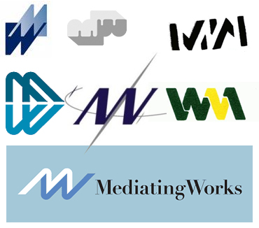
Some similar logos I found while searching.

No, I think you should stay with the first concept. Just play with it, you aren't so far.

I don't think a photographer's logo has to be readable in the same way that a grocery store's might. I liked the original mark and the direction of it.

I agree with Miss Tiffany. The italic looks odd because of the different angle thou. Experiment a little more with the type... the mark is looking good.

Mike,

love the initial mark. Don't worry about legibility, it's a mark and not spelling out your name.

Why not just try a simple line of text set in a sans serif (maybe Gotham) below?

Looking forward to the final result.

Seb

Use the first symbol. Stop thinking of others. All others presented here are completely different in style. Yours goes VERY WELL with work your friend does.
___________
Robert Koritnik

Captured from web.archive.org on 28 Jan 2014. view this capture