
I'm not sure whether I should be posting this here (Critique) or in the "Design" section.
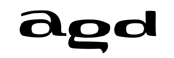
So, this is a very rough vector scetch of three letters of a face I have dreamed up.
It's supposed to be an ultra-extended, demibold (bold? black? <-tell me how you feel it is), slightly squareish (rectanglish, actually) DISPLAY typeface on the lines of what I have sketched, though the idea would be to make it much less edgy/rough. (I just could not care about the right bezier tangents when drawing this up at work while I should have been doing something else).
An other idea is that due to it's ultra-extendedness (which is equivalent to vertical compression) the layered letters (i.e. those which have a vertical structuring within the x-height: a,g,x,e, &c.) will have to leave the x-height (as you can see in the case of the 'a' or be cropped, but in a way, which would not decrease legibility (as you can see it in the case of 'g').
For the letters e and f (and some others) I'd plan alternates: for the e one that sits on the basline and has the loop in the ascender height, and one which has the loop on the x-height and the lower arc in the descender; similarly for the f.
My question is: do you like the idea? Is this font worth pursuing? Is there _any_ use or any market for such a display typeface?
Szabolcs
