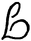
It reads pretty well. The main source of the "discombobulated" aspect is probably the lowercase n/e, which creates a mismatched double letter. See if you can rework it into a capital E, matching the I/E as much as you can. Also, I think you can make the L/G clearer both ways by attaching the bottom loop of the L at the bottom end instead, then making it much bigger for the g counter.
Long time absent from the forums - my hard drive fried a while back and sad to say I lost the font I'd been working on. Onward and upward.
Here's an ambigram I'm drawing up of my name. I think I have the basic shapes solved, but it's feeling kind of discombobulated in terms of rhythm. Any suggestions as to how it could be corrected?