
I just came across the results of the 4th Founder Award Competition in Chinese type design, which can be seen here (in Chinese). There are also critiques in English by Akira Kobayashi on some of the entries.
There are lots of good entries, but one that caught my eye was this an effort by Wang Tianjia (王天甲), titled "Chinese Characters Squared (汉字的平方)". Or at least that's what I think it means; I don't speak Chinese, so I'm relying on my knowledge of Chinese characters and a dictionary.
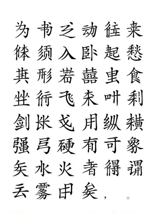
At first glance, it seems pretty normal, having a somewhat complicated look, like a text set in traditional Chinese. But for those who can read Chinese, what's amazing about this is that it is in fact simplified Chinese, but many of the elements of the glyphs have been multiplied--two strokes where there should be one, three where there should be two. Wang has created something like the effects of double vision, but disguised in a way that still looks sensibly like regular Chinese characters. It's something like unsimplified Chinese. Quite imaginative.
For comparison, here is another entry for the competition showing how the same exact characters should look.


