Hey Everyone,
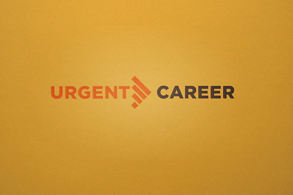
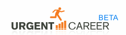
I’m working on a logo revision for a company called “Urgent Career”. Basically they offer a service that entails phone based interviews. I’m attaching their original concept, along with my revised one.
Basically I’m trying to clean things up and simplify the concept. I decided to take the bars (phone signal strength obviously) and titled it to create the arrow—which reinforces the word “URGENT”. “URGENT” is also used for the base of the arrow. I set “CAREER” in black because I really wanted it to stand out. I kept reading their company name as “Urgent Care” and really wanted people to realized the difference.
Anyway, any comments/suggestions would be greatly appreciated.
Thanks,
Mike
ORIGIONAL
REVISED