Hello,
I just had a brainstormy idea and wanted to ask people about how they feel about it. I have no direct plans to use it immediately, but if I get rather positive answers I might at some point.
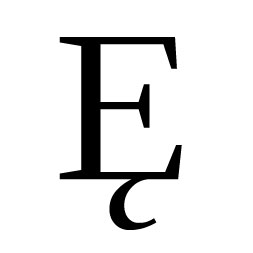
Now, there are a lot of serif fonts that have a
like Regent II, ITC Anima, Fritz Quadrata, Gill Facia, Hiroshige, etc. of which the capital U has a "descender", the second stroke hits the bottom, sometimes with a half serif there as well.
Most other serif fonts don't have this feature.
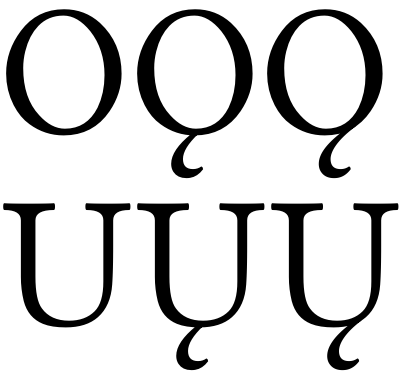
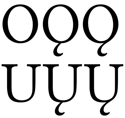
Now, starting from such a font (i.e. "regular" U without the foot), the idea was, that instead of attaching the ogonek at the middle, one could take an footed alternate of U to attach it. Considering that for a,e,i,u,A,E,I the ogonek is attached at the last stroke, at the right side of the glyph, this could bring in harmony:
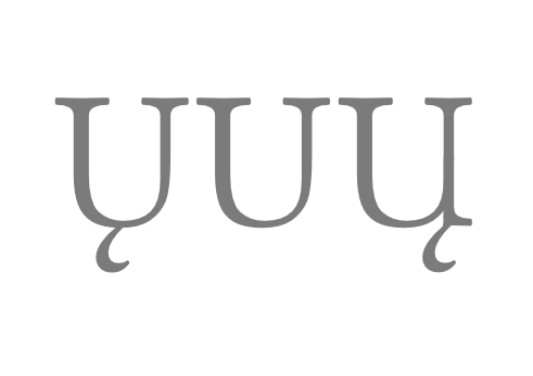
The image shows in the center the original U from Junicode (I like that font for experimental tweakings). to the left of it is the conventional, built-in Uogonek. To the right my proposal (roughly; this was just a quick patch-up).
The base form of the U would not be altered, so the first U's basic shape would look different from the second less the ogonek in LIETUVIŲ.
Does this make sense? How does it feel? Is it a nice idea, or would this detail distract too much while reading? Lithuanian input appreciated :-)
Also, I see that while the brings Uogonek nearer to its AEI counterparts, this also makes O a standalone exception. Then again, as I figured, o-ogonek is only used in transcribing Old Norse (and there the other ogenecked letters are not) and in some Native American orthographies, but there in complementery distribution to u-ogonek (either u-ogonek is used OR o-ogonek)*). If there is no text containing both o-ogonek and u-ogonek, that's not a problem (no visual inconsistency between right-palced and center-placed ogonek between O and U), and for languages containing both i-ogonek and u-ogonek (Lithuanian, some Native American) we have achieved a consistency among the ogonecked capitals (and also between lc and uc).
Or does that design look awkward?
And most important: did you understand this post at all, or did I — as usually — overcomplicate my description?
Szabolcs
_______________
* According to Wikipedia.