Typophile

Pakline logo critique

Kyrus

Hello.

First of all I’m new here, so hello to everyone, great forum you have here.

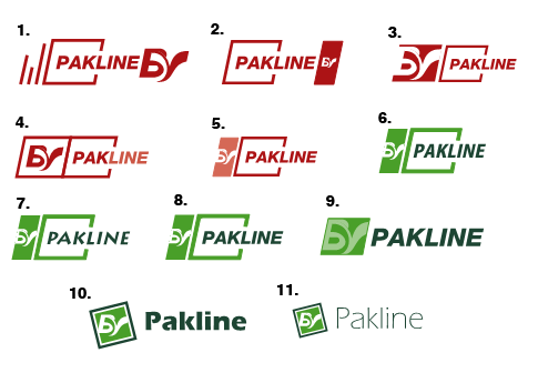
Now back to the topic. I’m designing a logotype for a company that produces and sells medical devices. We’re gonna have a a new line now tho, and we’re needing a logo for it. This line is called “Pakline” and it’s purpose is to include several products into one pack (eg. Surgical procedure pack). The following are the logotypes we designed so far.

Any critique would be appreciated, along with some ideas for new concepts.
Thank you.
Pedro Peixoto

http://www.piac.com.pk
Just Kidding with Flowers

what is the “by” suppose to signify? I like #6 without the little “by” icon. I like the enclosure and interaction of Pakline and square and rectangle. If you made the solid green rectangle a tiny bit longer on the bottom you might a pretty nice “P” concept out of both open square and rectangle.

I like # 10. Has movement. The rotated square would be better a couple of points up. Maybe the box all in green if you like that.

I personally like #10 both typographically and compositionally. But I think there is a stronger figure/ground relationship in #1 with the B and y. But that makes me question what that means exactly, like hola mentioned.

Hello and thank you for your comments.

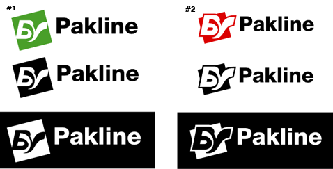
BV is a registered label that has to be attached to this logo, so I can’t cut it out. I’ve made some changes this morning, mostly towards the simplicity. Got two new examples to show and would appreciate further comments as always.

Cheers.

I like the idea of having the Pakline in a package.

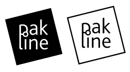
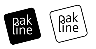
Ok finally something came out my mind and I made this new one:

I got a problem now though, I really need to put the BV logo in it, but I’ve tried several positions but none of it works. Any ideas?

Cheers!

If your new designs can ditch the BV business, then I think you should go with 1/2/3/5 without the BV business:

This element of your design is simple, and feels clean/sterile in a way appropriate to hospital products. Everything else feels tacked on.

—
Nick Hladek

with Nick on this one.

—————
Paul Ducco
Graphic Design

Captured from web.archive.org on 23 Oct 2008. view this capture