Hi everyone,
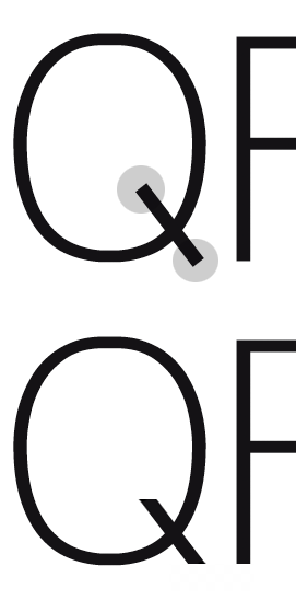
As refered here I started a new Sans inpired in those letters...special the "a". After some work, please find enclosed a PDF for comments...
I made it without any contrast in lines and started to wonder if a little of it won't help the final result. I made a "abc" in both cases just to give you an ideia here this may go.
Please feel free to ad comments!
Thanks in advanced.
António Fonseca
| Attachment | Size |
|---|---|
| tipo2.pdf.pdf | 55.73 KB |