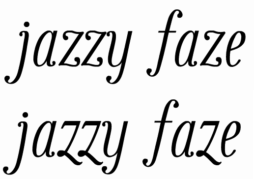
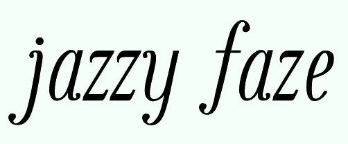
To me, it almost seems as though the lowercase and uppercase are from two entirely different families. I really like the caps. They sort of have a feeling close to Filosofia Grand (albeit italic), looking classic and refined, while the lowwercase have this quirky, playful characteristic about them. I think the curved terminals and ball serifs are making the rest of the letterforms seem a little more whimsical, which is not necessarily a bad thing. The kerning on the lowercases seems a little tight in most cases too. Is the "gg" a ligature? It seems as though the overlap isn't quite right. The width of the bottom loop may require it to be ligated. The bottom of the bottom loop also looks a little dark to me, along with the first vertical stroke on the lowercase w. The tittles and punctuation seem a little heavy to me as well.
Hi all
I'd like to hear your comments on this typeface. I know it needs work, but I'm not exactly sure which quirks are "features" and which are "bugs".
It's opentype with a few ligatures (mostly ones needed to get this particular text looking OK) and a couple contextual alternates. It's my first attempt at OT.
BTW, I just noticed the second attachment was marked 2 June 2007, which is impossible, so I fixed that.
| Attachment | Size |
|---|---|
| lathe.pdf | 18.59 KB |
| lathe.pdf (2 June 2008) | 18.71 KB |
| sample.pdf (7 April 2009) | 24.54 KB |
| sample.pdf (6 June 2009) | 24.34 KB |
| multilingual sample (6 June 2009) | 200.18 KB |