I have never designed type, but for the project that I am working on, I want to design a capital 'Ω' in Blackmoor LET, which does not have an 'Ω' as part of its character set. I thought to combine the capital 'O' and lower-case 'g' to make an 'Ω'. This is what I've come up with so far.
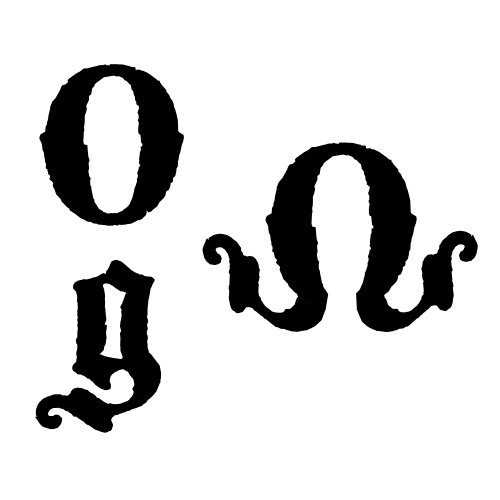
This will be used for a logo treatment for a youth group called "Omega Student Ministries." I like the sort of tattooed / distressed look that Blackmoor has. I am a bit worried, however, that it could have too much of a "Pirates of the Carribean" feel to it, however. If someone would like to suggest another font, then please do.
Thank you in advance for any suggestions you may have.
Edited for grammar.