
Hi,
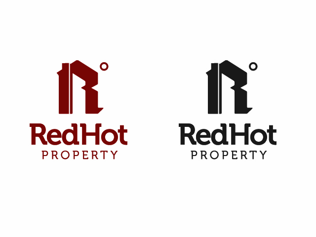
I've been working on this logo concept for an estate agent company. I am very interested to get anyone's thoughts on it.
I could do with some fresh eyes really. I'm not sure about the type yet, whether it'll be all caps etc.
Hi,
I've been working on this logo concept for an estate agent company. I am very interested to get anyone's thoughts on it.
I could do with some fresh eyes really. I'm not sure about the type yet, whether it'll be all caps etc.

I like how you've handled the wording, but the main logo seems lacking.
It looks half-way inbetween a blackletter 'r' and a house, and the ° symbol looks like a sun?
I think you either need to make it a house with a ° symbol, or else make it an 'R'.
The thought of that symbol though, a house or R with a ° is a wonderful and genius idea, take it right to the bank, that's the money-maker right there.
I wanna see more work on it and have it resolved better because it's not that often that a concept with that potential comes along.
EDIT: it's very ‘paul rand’ in it's simplicity and clarity of message

please post JPGs in RGB format so everyone can see it.
Sorry about that, i thought it was RGB, hopefully it should work now.
Innovati:
Thanks very much for your quick comments. It started as just the 'R' with ˚ symbol, but I wasn't sure if when used on its own whether it would be relevant to property.
I'm glad you think it has potential to work, I was starting to wonder if the message was clear enough

I'd make it the same 'R' as you have in the logotype, whatever you choose that to be.
Right now if I just saw the house/R I wouldn't recognize it as either an 'r' or a house.
If you have a red R° I think people will see R....red degrees hot? oh, Redhot! of course!
I think once they know the name there's enough information in R° to convey that whole thought.
Just for fun though, had you at any point tried red° or Red°? I know it's close to that stupid retard(red) campaign, but I think it could work as a viable alternative to help you keep some options open - and who knows, maybe you can develop that too and see if that does allow you any freedom R°doesn't (although it might be more limited too, you never know)
I wanna see more!
Thannks for your feedback. I'm excited about the potential of it, hopefully i can get something out of it.
I'll get to work!
Captured from web.archive.org on 17 Oct 2010. view this capture