The latest “Letterspace” newsletter of the TDC (Type Directors Club) has a fascinating piece on type history called “The Conceptual Basis of Type Design.”
In it Sumner Stone argues that the Jenson and Griffo made a fundamental break with scribal tradition, to letter designs that were critically dependent on the sculpting of metal, rather than on purely pen-written shapes. As this is what I was arguing in the lengthy “rule or law” thread, I was delighted to see strong support for this view.
The TDC is putting up past issues of Letterspace on its web site, so I suppose this essay will eventually be up.
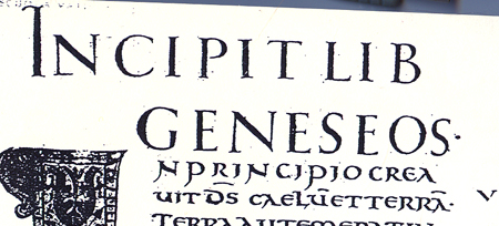
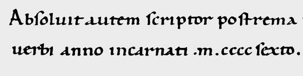
Meanwhile here is the argument in brief. In the early 15th century, scribe Poggio Bracciolini revived the Carolingian Miniscule (the basis of our lower case letters) and married it for the first time with Roman Capitals, rather than with Uncial or Rustic majuscules. However, Bracciolini did not do the Roman Capital style of serifs, following instead a style more natural to the pen, such as we see in the Lydian and Beorcana typefaces.
Later in the century, other scribes tried to emulate the much admired Roman Capitals more closely, building the serifs with many strokes of the pen. They also sometimes put symmetrical serifs on the lower case letters, which had not been done previously.
Now comes Stone’s new insight into the history. These later efforts were not really successful; they in fact were rather awkward. The reason is that the Roman Capitals, as Edward Catich showed, were originally painted—built up with a broad brush, not a pen—and then the painted part was carved out of the stone. Because the Capitals were really a painters’ and carvers’ style they couldn’t adapt very well to the fixed width pen.
This situation changed drastically with the introduction of printing and punch cut letters. Here the sculpting of letters in metal could emulate the fine, symmetric serifs of Roman Capitals, and put fine, tapering serifs on the lower case, to match the caps. Jenson started this and then Griffo completed the story with more fully symmetric serifs on the lower case. These styles more fully and successfully married upper and lower case letters.
Stone explains: “[The structure of the lower case] remained closely related to the pen-written letter, but thin, symmetric foot serifs replaced the thicker asymmetric pen versions and there was an increase in the overall formality of the miniscules.
“Thus, unlike Gutenberg and other early printers who used blackletter forms, the designers of the first roman types did not directly imitate contemporary scribal models. They used the freedom inherent in the new process of engraving punches to construct a new design in which the forms of the Roman capitals were more closely based on Roman inscriptional models and the lower case, perhaps a bit grudgingly, was made to adopt some of the features of the new/old capitals.”
In that earlier thread, I was more concerned with modifications of writing for the sake of even color in type. However, in any case Stone’s argument here indicates that the influence of “The Stroke” of the pen, while still very important in the development of type, is somewhat less so than what G. Noordzij indicates in his book of that name, and painting and carving have had a larger influence on the evolution of type design.