Typophile

Font identify

emilychicken

Does anyone have any nice examples of the following fonts in use?
Any ideas be HUGELY APPRECIATED!
Thanks...

arnhem
avant garde
bell centennial
bell gothic
bembo
benguiat gothic
beowolf
caslon
clarendon
cooper black
dante
courier
din
fedra
fette fraktur
franklin gothic
futura
garamond
hoefler text
interstate
joanna
knockout
letter gothic
lucida
matrix
officina
optima
palatino
perpetua
rockwell
quadraat
rosewood
scala
syntax
thesis
times new roman
trade gothic
trajan
triplex
univers
walbaum
zapfino

This doesn’t really belong at this forum, since you don’t want fonts identified. Is this an exercise for a class?

- Mike Yanega

That is a tall order. I have too much work to do to track down these fonts in use, but you could try searching for them at Typophile and you might come up with ID requests that lead you to their usage.

If you just need samples of them used for a limited number of words, you can use the test drives at MyFonts, or FontShop, for example. A couple of test drives of the same font can give you enough words for a sample sentence. Patty’s idea seems likely only to give you isolated words in many cases too.

- Mike Yanega

Hi mike, patty, Not looking for samples of the font, i am trying to find a nice example of each in use (posters/book covers etc) like for example mrs eaves on emigre covers, or experimental jetset using helvetica... (those are ones i’ve found this afternoon...) any things that spring to mind on the list is what i was hopeful for

... i’m designing a book about fonts in use

Sorry, that’s not the sort of thing one has lying around. I used to thumb through magazines and tear out pages and write on them what font(s) they used, but even if I kept a file of these, which I didn’t, I don’t see how that could help you. You need to build a collection like this for yourself — it’s a great way to practice ID skills — but I don’t know how this can be done quickly for such a long and specific list.

- Mike Yanega

If this is for a book, maybe the vendors of the fonts would be interested in providing examples of their fonts in use.

- Mike Yanega

thanks mike. i’ve got a scrapbook that i have been building for 4 years but there are gaps in it and some images are very old. Any help from anyone be much appreciated.

Hi Emily!
Yes, this request is way too broad, sorry. One or maybe two typefaces – okay. Everything else is really time-consuming. You could at least state what you have found yourself, so far, or what medium/period etc. you are focussing on. See also this similar request.

All I can do is give some general advice for finding typefaces in use:

Search typophile.com. Most of the faces you need have been asked for before. There’s a lot to find.

Linotype.com has a pretty neat in use section.

A lot of other foundries maintain such showcases aswell.

Especially if you’re looking for images, searching Flickr (or similar services) has proven helpful, to me. You might try adding ‘font’ or ‘type’ to your query, when searching for short/ambiguous terms like ‘Arnhem’, ‘Bell’ or ‘DIN’.

F

thats super helpful, thanks so much. thank you thank you!

Cooper Black - The cover of “Pet Sounds” by The Beach Boys.

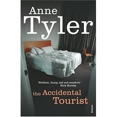
Clarendon - The new jackets for Anne Tyler’s novels published by Vintage in the UK.

brilliant, thanks very much for those - that’s just what i’m looking for

Trajan you can find in most epic movie titles.

Bell Gothic was used about 10 years ago in a huge ongoing Guinness advertising campaign.

Interstate you could use any highway signage.

for Bembo you can try and find “bembo zoo” It’s a book...but I’m pretty sure if you googled you’d find some images you could use.

don’t forget to check Flickr ...

for example

http://www.flickr.com/photos/lrhb/228602229/

You could search Flickr for this stuff. Search for fonts by putting “font” on the front of the typeface name.

For DIN: http://www.flickr.com/photos/tags/fontdin
For Eurostyle: http://www.flickr.com/photos/tags/fonteurostyle
For Bell Gothic: http://www.flickr.com/photos/tags/fontbellgothic

Et cetera. Don’t thank me, it’s something I’ve noticed Stephen Coles do a lot in his increasingly tasty Flickr stream.

Hey Joe, look up two posts, haha :D

schwing: http://www.youtube.com/watch?v=zNCrMEOqHpc

Some of the more classically-cited examples for some:

Cooper Black: You’ve gotta go with the Beach Boys’ Pet Sounds album. It single-handedly revived Cooper Black.

Joanna: A lot of J.Crew’s signage uses Joanna to great effect. Also, Obama’s campaign signs are set in Joanna, if I’m not mistaken.

Optima: You can’t find a better example of Optima than the Vietnam Veterans Memorial.

Trajan: Any movie ever.

Univers: The Munich Olympic logo was set in Univers.

BJ, I’m just suggesting adding “font” to the front of the query to find type specific tags...

I do love that ad though: “You said exactly what I just said, except you did this. (Gesturing with hands.) No, I did this... (gesturing with hands.)”

ah, i see, good call :)

WOW! Thanks so much... i’ve got to say its really hard to find interesting examples of the more obsure ones... thanks!

Which do you find to be the more obscure ones?

i’m finding it hard to come by any benguiat gothic, officina, quadraat, palatino perpetua... looking into a stack of old baseline magazines and there’s some gorgeous modernist posters, stacks of helvetica... quite difficult to find beautiful work made with beautiful serifs

avant garde font was made specifically for avant garde magazine? what a gorgeous magazine... wow

The Economist magazine was using Officina. There’s some information on Eric Spiekermann’s blog.

http://www.spiekermann.com/mten/2007/01/itc_officina.html

From the top of my head:

Arnhem:
The redesign of the Dutch newspaper Het Financieele Dagblad uses Arnhem. Yves Peters has written an article about it on his blog: “Mark Porter redesigns Het Financieele Dagblad” (scroll down untill you see the salmon colored paper). Maybe you can buy a copy of the newspaper somewhere?

Fedra:
I know the KABK (Koninklijke Academie van Beeldende Kunsten) uses Fedra Sans in its identity.

Thesis:
The German TV network ARD uses Thesis (mainly TheSans) in its identity.

and as for zapfino... nightmare

Dr Doc - Obama’s campaign signs are set in Gotham.

I enjoyed the use of Benguiat Gothic in the last Janet Jackson album.

I enjoyed the use of Benguiat Gothic in the last Janet Jackson album.

Pentagram set up the DMA with Fedra. It looks great in the underground parking garage—no joke.

http://dallasmuseumofart.org/Dallas_Museum_of_Art/index.htm

Jayyy, Joanna is the serif used by Obama’s campaign.

You wrote:
’avant garde font was made specifically for avant garde magazine? what a gorgeous magazine... wow’

Actually, Herb Lubalin designed a logo for the AvantGarde Magazine, and this became later the typeface. The original by Letraset for instance had very interesting alternatives, which were not easily available digitally until recently. At ITCfonts.com you can see them now in the AvantGarde Pro series. But when you look at (old Letraset catalogues and) the ElsnerFlake EF alternative designs, you will see a few very distinct letters (e, v, w, y) that did not make it to the Pro obviously.

Many gorgeous headlines and logos resulted, and i am sure that you will find samples everywhere. Although it seems that AvantGarde is not extensively used recently.

Captured from web.archive.org on 2 Jan 2010. view this capture