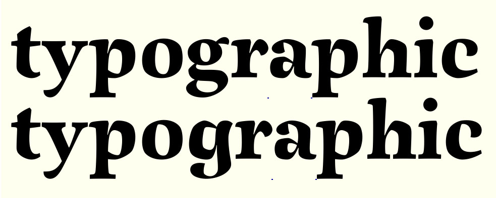
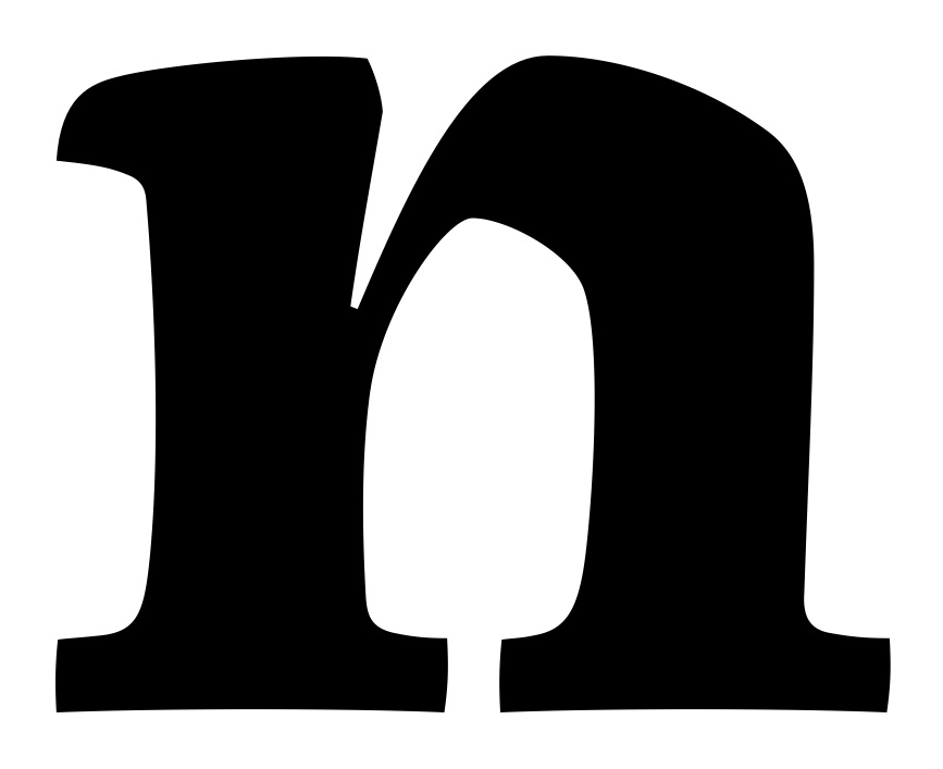
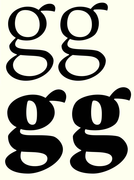
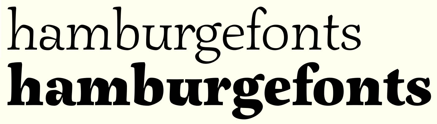
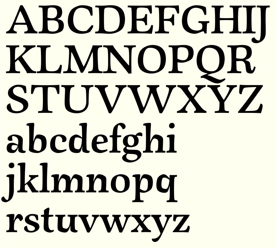
This is something I've been playing around with for a few days. After my last script font Olicana was so well received I started thinking about a calligraphically influenced serif - something with plenty of movement. What are your thoughts of it so far? Maybe I'll do an infant 'a' to go with the alternate 'g' for a different stylistic variation.
Is it worth pursuing this? I have no idea if something like this exists already - does it? and is this different enough?
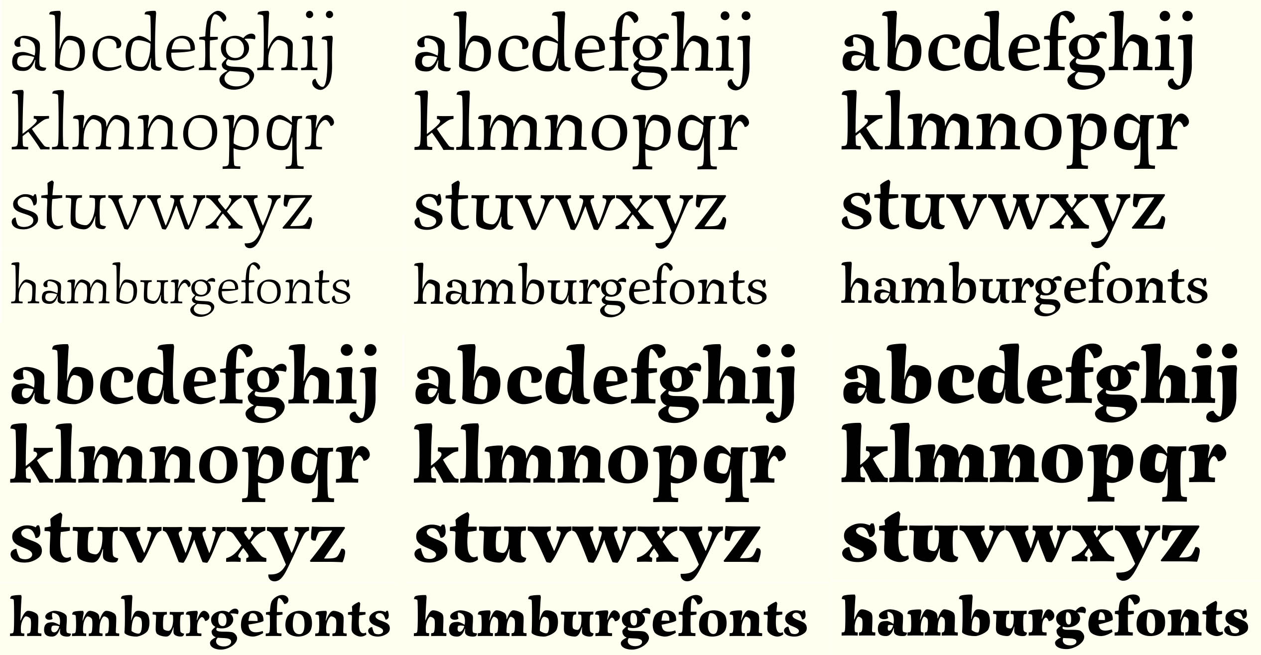
This is the Extra Black style, I've also done some Light glyphs. There will probably be 6 weights (if the response is fairly positive, otherwise I'll abandon it and come back to it when I've finished all my other half-finished projects).