

Couldn't seep last night... so i decided to try and draw some characters! Would love to hear your opinion!

Pedro,
Gosto...
translation: I like it
Numa primeira "leitura" acho que o Z não está bem conseguido. Podes melhorá-lo concerteza...
translation: In a first reading I think that the result of Z its not good. You can improve it for sure...
O facto do U estar fechado tambem me incomoda...
translation: The close of the U also bother me...
Continua o bom trabalho!
translation: Keep the good work!
António

Hi there,
I second Afonseca, the closed "u" and the "z" doesn't work with the rest. What you are going to do is up to you.
Cheers
André
António,
antes de mais obrigado pela tua opinião!
Translation:Thanks for you opinion!
Concordo plenamente com o que disseste relativamente ao U e ao Z. Vou tentar corrigir essas letras e já as ponho aqui!
Translation: I agree with the comments about the U and the Z. I'll redraw them and post it here for feedback!
I believe that I have solved the Z problem. the U/V one not so much, what do you think?

Perhaps more like this!
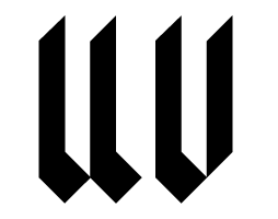

The attempt looks very good to me so far. I see it as a fresh approach to fraktur. Of course, capitals will be needed, and äöüß, and long s, to say nothing of ligatures [long s + t], ch, ck etc., and - since we're chatting in Portuguese - que tal incluir também áèîõüç e família?!
Ronald Kyrmse
geocities.com/kyrmse & geocities.com/otsoandor
"a fresh approach to fraktur"
Thanks for the compliment kyrmse! Now I'm really into developing this font. And yeah, I'm thinking on doing all that stuff. Still don't know how the capitals are going to be but i have some ideas for the ligatures! I'll post it soon.
Ps: It's nice to see so many people talking Portuguese around here!
Hi Pedro!
I like you U and V now...but the Z :-(...
I think it still looks an inverted S or 2...
I dont know much about black letters and how to draw them but here is a (bad draw) ideia of the Z...

António
António,
I can also see a crossed 0 sometimes when i look at my Z. I'll give your version a try to see how it fits along with the other letters. I'll post it along with the double s when i finish it! Once again thanks for the help!

This reminds me a bit of my unfinished geogothic font on fontstruct. Since this is so modular, it looks a lot like a fontstruct font (or is that in fact how it was made?). Given that resemblance, you might look at blackletter fonts on that site to give you ideas on how to solve some of the trickier letters.
I tried the António suggestion for the Z, see what you think of it! I also tried to do a double s (just learned about it) but i think I've done it wrong!
Does the S looking part need to be on the baseline? And should the f looking part be an ascendant?
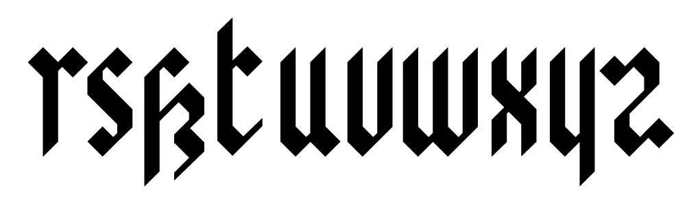
Eliasson... it isn't a fontstruct... but yes, i based my self on a modular scheme! I did the o as a start point and the adjusted the basic shapes to create the other characters!
Thanks for you suggestion I'll take a look.

I like your work so far, however, sometimes you're using too many elements in order to achieve the shape. About the Z, IMHO the best Z is the first one and then the second one. This last Z doesn't resemble the overall look of the glyphs. I did this Z just for fun, using the idea of the 'x' glyph in your alphabet, you kept it clean, upside and down.

It's just and idea, nothing else, but my point is that in the same way you worked with x, y, r, you should clean a bit some other glyphs. However, it's a great kickstart. Take a look at the free font Metalista to see how they solved some other glyphs.
Regards.
Thanks ilovecolours!
I agree with you wen you say I'm probably using too much elements... it´s a very modular design, and probably I should start adding some details that improve the letter legibility and simplify their shapes!
It's curious that you mention Metalista because that is the font that got me inspired!
On a first stage I tried to abstract myself from that font, In order to try and create my own solutions, but I'll take a second look at it now and try to clean some of the shapes!
Regards.
Captured from commoncrawl.org on 28 Apr 2015. original URL