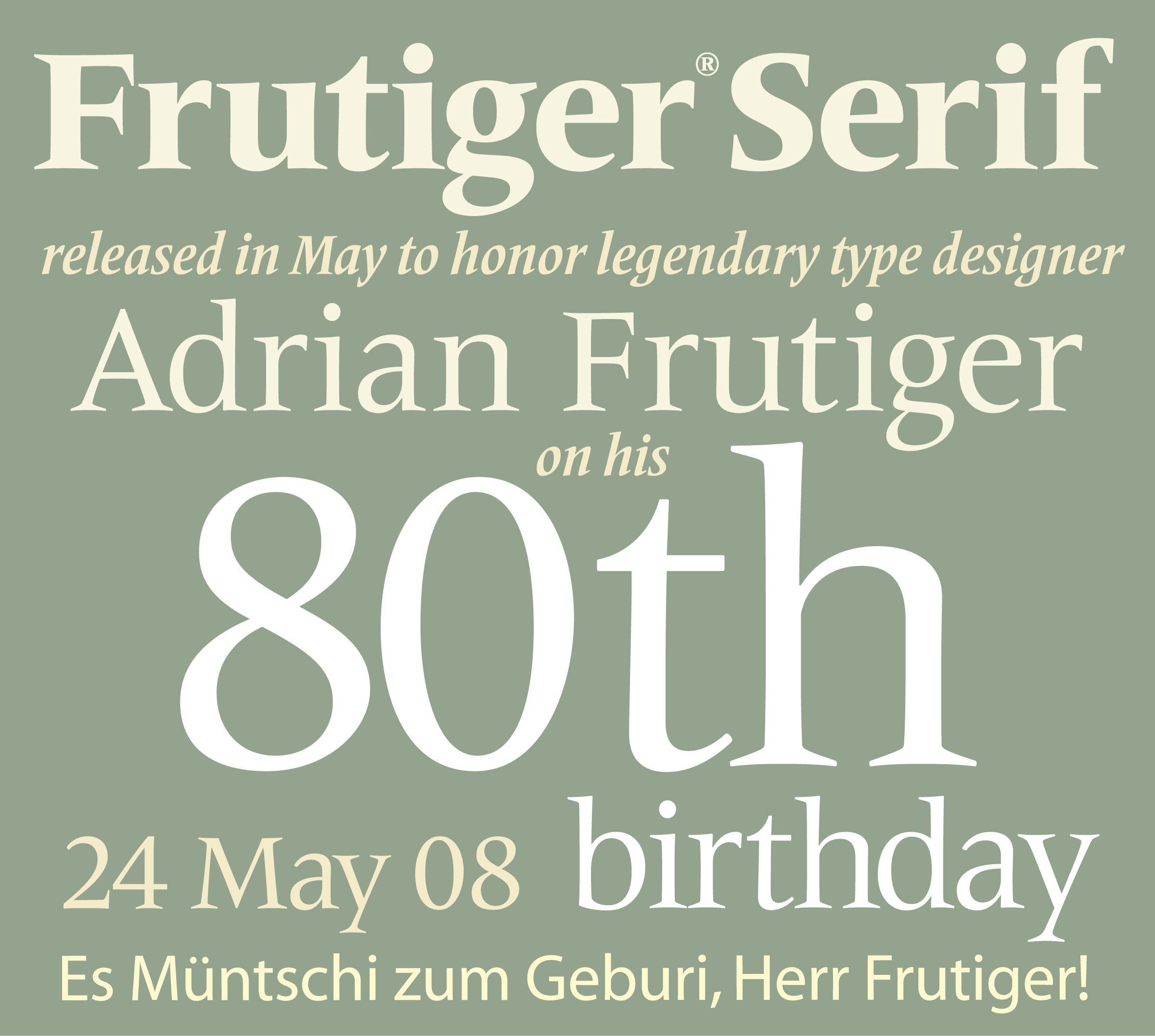
The typeface foundry and subsidiary of Monotype Imaging Holdings Inc., Linotype GmbH, has introduced the Frutiger Serif typeface family, a new 20-font offering was designed by Akira Kobayashi, type director at Linotype, and Adrian Frutiger, who designed the original Frutiger sans serif design along with other popular typeface families including Univers, Avenir and Vectora.
The Frutiger Serif design is based on the Meridien® typeface, one of Frutiger’s first, released in 1957. The Frutiger Serif typeface family is available in five weights ranging from light to heavy, and all weights are available in both regular and condensed versions. Each has a corresponding italic, in addition to a condensed italic. The Frutiger Serif fonts support 48 western, central and eastern European languages, including Baltic and Turkish. The fonts are available in the OpenType® cross-platform format and include OpenType features such as ligatures, small caps and several numerical figures.
Individual Frutiger fonts, selection packs and typeface families can be viewed online at www.linotype.com, www.fonts.com and www.faces.co.uk.
The initial Frutiger typeface was originally designed by Frutiger for the Charles-de-Gaulle Airport in Paris in the 1970s. In 1997, he completed the Frutiger Next family, developed for signage at the Alte Pinakothek in Munich and then becoming commercially available in 2000 as a Linotype typeface. Other variations available from the Linotype Library are the Frutiger Stones™ family, which incorporates the look of polished pebbles as the boundary; the Frutiger Symbols design, a family of symbol fonts; the Frutiger Capitalis design, a font containing ornamental glyphs; and Frutiger Arabic, designed by Nadine Chahine of Linotype and released last year.
| Attachment | Size |
|---|---|
| FrutigerSerif-PR.jpg | 714.45 KB |