
Hi guys, I need some genuine and honest comment about my logo design for a yoghurt treat store. The meaning behind the logo (yogo) is a combination of yoghurt and go, my target audience is on-the-go consumer.
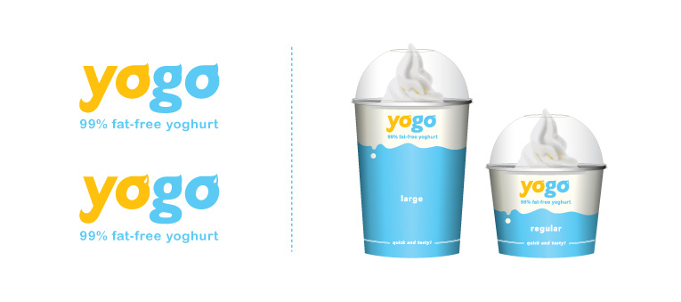
Hi guys, I need some genuine and honest comment about my logo design for a yoghurt treat store. The meaning behind the logo (yogo) is a combination of yoghurt and go, my target audience is on-the-go consumer.

It's nice. I prefer the top version without the little white accents. Nice color choice. Fonts choice has a nice friendly feel too.

Looks great, you're definitely on the right track! The white accents are distracting and too small to convey significance, so the top one is the best choice. It is excellent, however, I'm looking at it (purely subjective) as a conflict between good and evil (devil horns vs angel wings). The colours work, but what if the swirls are more pronounced?

I'd also make the swirls a bit more pronounced. Maybe take in the join at the southeast corner of the swirl so it doesn't look so heavy.
Also, FYI: http://www2.kelloggs.com/Brand/brand.aspx?brand=231
- Lex

I'm liking it too.
agree with comments above also, would be interesting to see it a little more pronounced.
----------
Paul Ducco
Graphic Design

The colors are great. I really adore the type treatment.
Just FYI
http://www.danisco.com/cms/resources/image/4687a350814cfe43/yogo.jpg
And Kelloggs also has a product called Yogo's
I made some changes with the logotype by making the swirls more pronounced but not over pronounced as I the swirls may look like devil horns. Anyway, hope to hear more comments and feedbacks from all of you. Thanks!
Chriswong
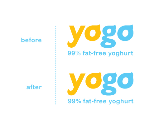
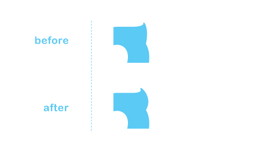
:-)
- Lex

Perhaps drawing the "horn-wings" on top of the letter instead of in the right corner would lessen the evil/good appearance and make they ressemble closer to the yoghourt picture.
Anyway, nice logo
Just my 2cents.

ice-creamish

I like it too and I don't get any devil hornsy impression. I would love a taste!
Sharon

Chriswong reshaped swirls are great! Really enjoying the overall result.

I know it's not your idea, but it reminds me too much of:
http://www.yoplait.com/products_gogurt.aspx
as a concept.
I like your treatment of it tho, if only you had better criteria to work with! Wonderful colour choices!
I made some changes again with my logotype, here's a picture showing the changes that I have made. I kind of made the swirls blunder and discard the swirl on the letter 'g'. I also experiment using the typeface Candice and modified it for the letter 'y' and 'g', I am not sure if it works better with the typeface Candice or stick back with the original logotype. Hope to receive more comments from all of you. Thanks.
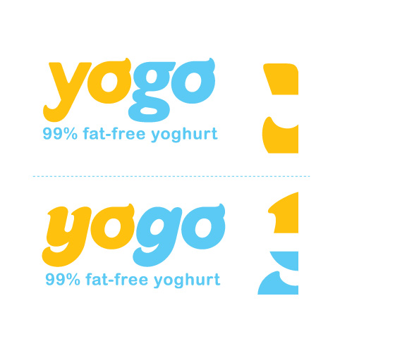

I think the swirls on top one have more of a yoghurty appearance. Also the 'g' on the top on has that feel of yoghurt coming out of a dispenser.
I think the swirls on top one have more of a yoghurty appearance. Also the 'g' on the top on has that feel of yoghurt coming out of a dispenser and is a nice subtle touch.
Sorry for double post!

I really like the new changes. A lot. That bottom sample has so much more life. Now if you were just using Omnes instead it would be perfect.
The reason I like it is the tips of the yoghurt seem softer and more real. They needed to be exaggerated. I'm glad you did that.

Really nice work Chris!
Special thanks to Miss Tiffany for suggesting the use of Omnes typeface on my logotype, it really does work. I replaced the letter 'g' with the Omnes typeface and the curve on the top of the letter 'g' seems to look and curve better. I also used the Omnes typeface for the phrase below logo to give a bolder and creamier look to the whole logotype. Thanks for all the comments again guys.
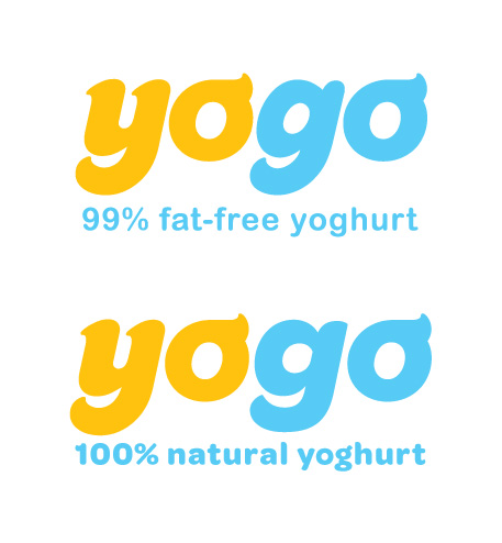

Great work. The new g looks better.
I think the descender on the g should match the y though.

IMHO the logo looks a bit "fat" instead of "fat-free". In the current state it says "yoghurt", but (again, to me) it doesn't says "fat-free". It looks like a tasty, sensual, delightful, joyful yoghurt, and we all connect these things with fat (you know that foods tastes better to westerns because of the fat). Fat-free on the other hand is more like following a strict diet, have some discipline, etc. I like the word game, colors, evrythng, I just think that the sans-serif font fits more into the brand.
Finaly, how about using Oldstyle figures for numbers?
The idea that something is skinny, for me, equals diet which in turn equals blech! On the otherhand if it is full-fat we know it must be good. So I'm thinking it is ok to use a bolder typeface for something that is natural and not skinny. No?
I liked how the tails on the y and g matched before. And the counter of the Omnes g is changed a bit. But, you could take a cue from that shape for the o (s) as in a way they are like you drew them with yogurt. No?

Sometimes, it is best to just leave what is quite good alone.
This works. Be happy.
Hi guys! Again, thanks for all the comments and I am now finally completed implementing my logotype onto my package design and I am very happy with the result. Attached are some photos of my package design. Thanks!
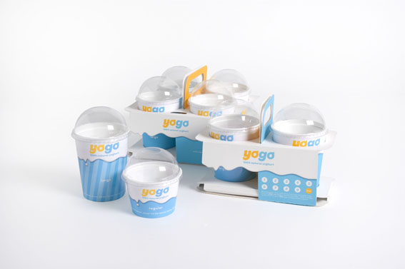
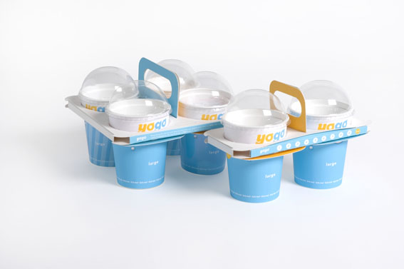
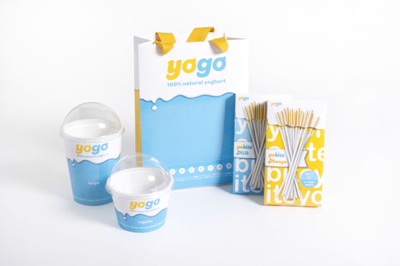
The carriers above come in two different sizes, one holds 4 cups and the other one holds 2 cups. They both can be folded from just a single piece of card without using any glue. The reusable carriers will encourage consumers to reuse the carrier to earn stamps. When they have earned enough stamps, they can redeem a cup of frozen yoghurt from the store.
The reusable theme is also applied to the paper carrier bag.
You did a great job on this!

I'd like a large tangerine and blueberry yoghurt with whipped cream (I want it to match the cool packaging!) Nice job - it all looks very tasty.
Great job. What are the two boxes on the right in the lower picture?
They are called "Yobite" which is a dipping stick where you can dip into the yoghurt and eat with it. The original idea came from the well known Pocky Sticks from Japan.
Freaking adorable.
Okay I'm editing because I realize that's not a very sophisticated response... but it was my first thought.
Agreed. That turned out lovely. Congratulations on a good job.
It's great to see the concept through to the product.
Ross
Nice development. Would Paul Rand approve?

The color choice definitely positively affected the way the packaging appears. Certainly makes me want a yogo! Great work!
Hi chris,
Could you please provide me with your email, i need to get in touch with you ... thanks

Great work! Thats some tasty type.
Hi ChrisWong,
I'm still waiting for your email ... thanks

@uaetrade: http://typophile.com/user/31018/contact
Captured from web.archive.org on 17 Mar 2014. view this capture
