Typophile

Scotch Romans in books

jesper

Hi,
I know that Matthew Carter’s Miller was designed for newspaper use. However, trying different fonts for body copy in a book I’m designing right now, Miller looked just right – thus I’ve decided to use it.
Is this a faux pas?
Are there any cultural connotations or traditions regarding Scotch Romans that I am not aware of?
Will I be laughed at by typophiles?
The book is printed on cheap uncoated paper – isn’t this one reason a newspaper font would actually work better?

On the cover I used a combination of Neutra and Miller Display Italics.
Again, did I go wrong here?
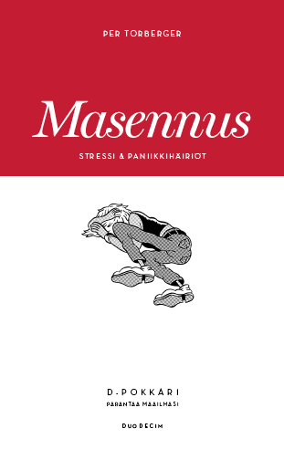
Is this book a romance novel? A collection of anecdotes? A guide?
The type should match the text.

Scotches are truly beautiful!

Matthew Carter designed Miller with newspapers and magazines in mind. And since you are using Miller Daily, even more so. It has the most “literary” feel of the do-it-all scotch systems lately. Chronicle is the most sterile. The only thing that concerns me is that Miller Daily has (I think) shorter descenders and ascenders. These are key for reader cognition.

People set books in Times all the time- does it look great? - not award winningly so, but Miller is much better than Times.

Your cover is lovely!

Mikey :-)

PS... Why are you using cheap paper for a book?

Thanks Mikey,

About the book: actually there will be forty titles or so in this series. The assignment is from a medical publisher, they wanted something simple and clear for their new paperback editions to be sold in pharmacies, supermarkets and kiosks here in Finland. As the titles vary from depression to insomnia and smoking I decided to do something generic. The color in the upper Fibonacci section will always be a different PMS spot and the little black supersharp 1-bit image will change with the theme. Besides that, they’ll be uniform. The texts are prose - or kind of ... so I felt that a “medical” font would feel too cold. The idea here is to get close to the reader with rather difficult issues.
I myself come from a magazine design background. Maybe that’s why I went for Miller and the descenders and ascenders feel ok to me. Somehow finnish looks better that way ...
The paper was already chosen before I was called in, and it’s not super bad ...
By the way, I tried Chronicle. Didn’t work.

Miller looked just right - thus I’ve decided to use it.

You answered your own question. Trust your own taste and develop your own typographic style.

The type should match the text.

In what way should it “Match” the text? I have no idea what you mean.

Caledonia — and for that matter, Century Expanded — were popular book fonts in the 1960s and 70s. Remember, this was fairly early days for using photocomposition for books, and both Ne

Captured from web.archive.org on 6 Sep 2008. view this capture