
Can you please identify the font used in this logo? Thanks for any help.
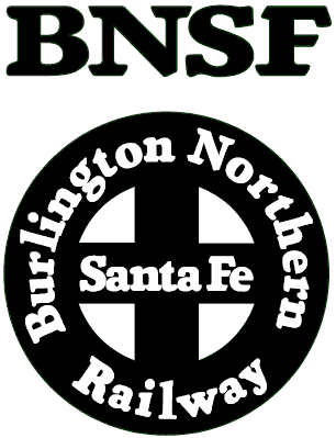
Can you please identify the font used in this logo? Thanks for any help.
How old is this design? It reminds me of the slightly squared adaptions of Cooper Black I've got in showcard & signwriting books from the '40s & '50s. Cooper Poster from Grouptype is the only digitised example I found in a quick search but it is a little too ornate. I think there might be a Nick's Fonts one.
The BNSF was formed around 1995, so my guess is the logo was designed around that time. Is it possible that it's just custom lettering for the logo?
1995! I thought you were going to say 1955. As the layout is very irregular on that circle yet repeated letters appear to be exact I'm imagining it was done with individually cut out letters from a photocopied alphabet. It looks more like a signwriter's work than a graphic designer's. You could get a fairly good match with the original Cooper Black given a slightly heavier weight.
I can also imagine the rather clumsily balanced BNSF being copied from a book like the one below and then the outer edges cut into for more of a slab serif look.

(Showcard lettering master Mike Stevens personal take on Cooper Black from his mid-'80s book Mastering Layout.)

I'd say it was a custom job, not based on a particular font, but on the Santa Fe RR logo. The Santa Fe logo goes back at least to the 1930s. Until Santa Fe and Burlington Northern merged in the Nineties, BN used Frutiger (possibly modified slightly) on its logo.
Captured from web.archive.org on 21 Feb 2015. view this capture