
Hi everyone,
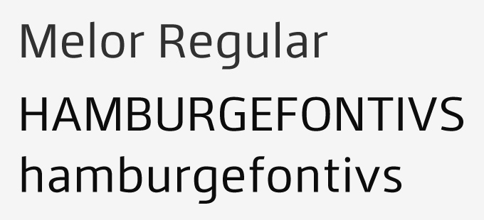
I have been developing a squarish sans intended for text (e.g. in brochure), for now there is only regular weight, others are still under development. I would like to hear your opinions on this before I move on.
Do you think this font can differentiate itself from other square sans? What do you like or not like about the letters?
Comments and criticism are most welcome. Thank you for taking a look at this.
Marica
| Attachment | Size |
|---|---|
| melor-regular-mp.pdf | 32.48 KB |


