
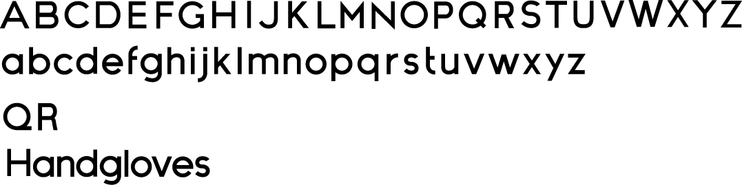
I recently finished both upper and lowercase letter forms for a new geometric sans-serif I'm working on. Similar to Gotham & Futura.
I've included two alternate character ideas on the third line. I kind of like that Univers inspired Q, wasn't as fond of the R (it was just the first one I made), I think I might just delete it.
I intend to complete punctuation marks, some common ligatures where they may be needed, then different weights
Looking for tweaks to be made, specifically on some of the lowercase letterforms.


