
There was recent mention of the Bringhurst "bible" and its focus on book typography.
I looked at the book I'm presently reading. A somewhat anecdotal approach for generalization, but a pretty typical example of what's out there.
The book is a finalist for the Los Angeles Times Book Prizes, and made the New York Times Bestseller list, so there is absolutely no excuse for the cheap and shoddy typographic design, which, according to Mr Bringhurst, dishonors the text.
It severely pains me to read the damn godless thing, which is frustrating, as it's quite interesting, and I would like to finish it.
Here are a few of the issues.
.

1. The cover. A bit dreary, but nothing terribly wrong, apart from a bit of sheep shagging. The question that must be asked though, is why this bears absolutely no relationship to the design of either the title page or the main text. Isn't there something horribly wrong with this institutionalized norm?
.
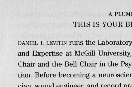
2. The very first page. Right off the bat, faux small caps!
.

3. The title page.
.
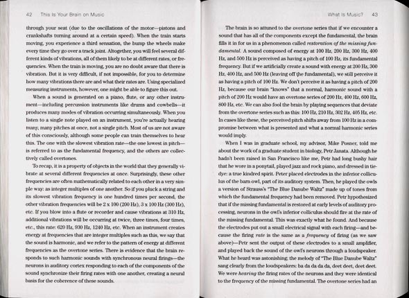
4. Main text. Where are the margins? There's nowhere to put my thumbs! It's incredibly dysfunctional to be holding the book at the top as one reads the bottom of the page, causing shadows, and making one's arms ache.
.
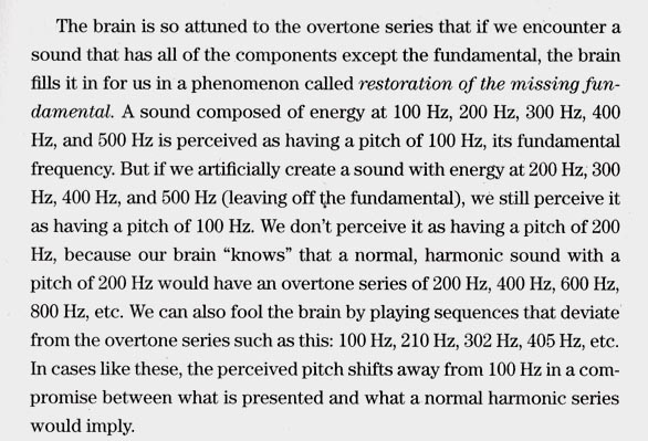
5. Tabular lining figures. This is a book with a lot of numbers in the text, so wouldn't that be a tip-off to the publisher that it might end up looking like a technical manual? Didn't they notice? There's nothing inherently wrong with the Century style of face for text--except that surely, in this day and age of InDesign and all the marvellously-featured fonts that Adobe bundles with it, a book publisher would use a typeface that has old-style figures, or at the very least, proportional figures? Finally, a small thing; it would have been better to not break lines between the numbers and "Hz". And wouldn't ff ligatures be nice?!


