Hi everyone,
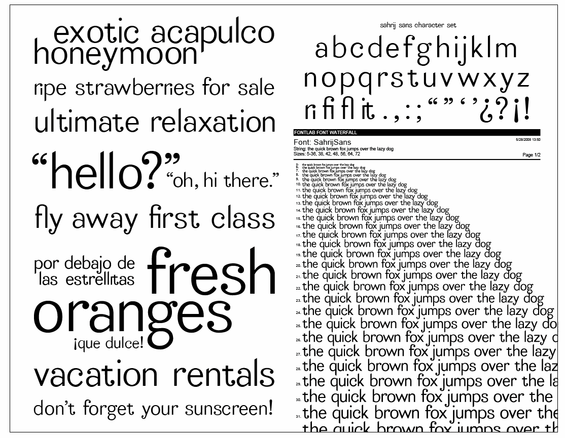
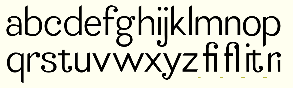
This is my very first attempt at a typeface, and it was inspired by some hand lettering I did for a logo. I know there's still a lot of tweaking to do, and I would love love love any feedback!
Thanks in advance!
Cassie

| Attachment | Size |
|---|---|
| Picture 45.png | 50.41 KB |
| Picture 44.png | 108.99 KB |